| Author | Thread |
Comments Made During the Challenge  |
|
|
04/14/2009 03:29:48 PM |
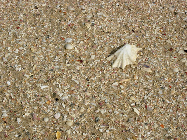
| I'm glad you included the larger shell in a thirds position. It gives the eye a place to rest and take a break while looking at all the interesting texture you have going on. contrast looks pretty good. Maybe a tad more? But maybe not. I'm not much of a fan of borders but it might help in this case to keep me in the photo. Nothing elaborate just a little one. Good large dof and focus. |
|
 Photographer found comment helpful. Photographer found comment helpful. |
|
|
04/12/2009 06:54:18 PM |
| Nice composition, clean image, cute title.....6 |
|
| Photographer found comment helpful. |
|
|
04/10/2009 11:52:35 AM |
| Elegant and simple with no major issues. A good solid entry into the challenge and worthy of a top 30 finish. |
|
| Photographer found comment helpful. |
|
|
04/10/2009 10:40:45 AM |
| nice shot, it definitely has texture. i'd prefer it if it was cropped a little tighter so i could see more detail in the large shell. just my preference |
|
| Photographer found comment helpful. |
|
|
04/08/2009 04:25:48 PM |
| makes my feet hurt..know what walking on that feels like |
|
|
|
04/08/2009 04:25:10 AM |
| Its a great idea, good framing, but it would be good to see the real 'crunch' of the shells closer up |
|
Home -
Challenges -
Community -
League -
Photos -
Cameras -
Lenses -
Learn -
Help -
Terms of Use -
Privacy -
Top ^
DPChallenge, and website content and design, Copyright © 2001-2025 Challenging Technologies, LLC.
All digital photo copyrights belong to the photographers and may not be used without permission.
Current Server Time: 04/07/2025 02:03:09 AM EDT.