| Author | Thread |
|
|
04/18/2009 04:24:27 AM |
| A beautiful capture; one of my 10's! I love your perspective. |
|
 Photographer found comment helpful. Photographer found comment helpful. |
|
|
04/16/2009 11:37:12 AM |
| that is excellent exposure control, nice to be next to you in this challenge! |
|
| Photographer found comment helpful. |
Comments Made During the Challenge  |
|
|
04/10/2009 04:12:34 PM |
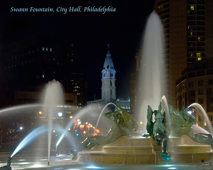
| Great postcard style shot. Good exposure, lighting and colours. Looks like you have cropped a little of it out though judging by the aspect ratio, and I think it would have been better to get the whole fountain in the frame since that is your subject. |
|
| Photographer found comment helpful. |
|
|
04/10/2009 08:30:06 AM |
| For some reason this has reminded me about some national talk show absolutely awful song about Philadelphia. He needed more than a bucket to carry the tune. It was pretty bad. Your entry is much better than that song was. |
|
| Photographer found comment helpful. |
|
|
04/08/2009 05:04:16 PM |
I hate you font therfore you get a 1.
well maybe not, i guess the rest of the image is pretty prefect, not sure how you managed to get the lights right on sigh a disparity of subjects, but there they are, just as they should be in a postcard. I'll give it an 8 and a ribbon prediction, even though I really don,t care for the font. |
|
| Photographer found comment helpful. |
|
|
04/07/2009 06:13:03 PM |
|
| Photographer found comment helpful. |
|
|
04/07/2009 02:04:22 AM |
| A little too much fuzz on the water? Actually that's the main feature, so it dips out as a postcard. Text doesn't tell us where Philadelphia is. |
|
| Photographer found comment helpful. |
|
|
04/06/2009 09:31:33 PM |
| the composition is a bit messy IMO but good capture |
|
| Photographer found comment helpful. |
|
|
04/06/2009 03:38:18 PM |
| no vote, just commenting. the composition is very nice. Needs a little more contrast & punch for a postcard IMO |
|
| Photographer found comment helpful. |
|
|
04/06/2009 10:17:19 AM |
|
| Photographer found comment helpful. |
|
|
04/06/2009 07:43:06 AM |
| An iconic image of Philadelphia. The highlights are a touch over done, but it does evoke the impression that somebody has been to Philadelphia. The font is appropriate as is the color, but it's placement is too high and could be brought lower to fill in the dark void above the buildings on the left. |
|
| Photographer found comment helpful. |
|
|
04/06/2009 07:23:54 AM |
| The fountian alone would have been a better shot. |
|
| Photographer found comment helpful. |
|
|
04/06/2009 05:38:57 AM |
| Lovely photo! Good exposure on the fountain. I can see this as a postcard for sale. |
|
| Photographer found comment helpful. |
|
|
04/06/2009 05:17:15 AM |
|
| Photographer found comment helpful. |
|
|
04/06/2009 04:27:35 AM |
| nice handling of exposure. viewpoint isn't the most inspiring |
|
| Photographer found comment helpful. |
|
|
04/05/2009 08:13:44 PM |
|
| Photographer found comment helpful. |