| Author | Thread |
Comments Made During the Challenge  |
|
|
04/11/2009 10:59:46 AM |
|
|
|
04/10/2009 03:42:22 PM |
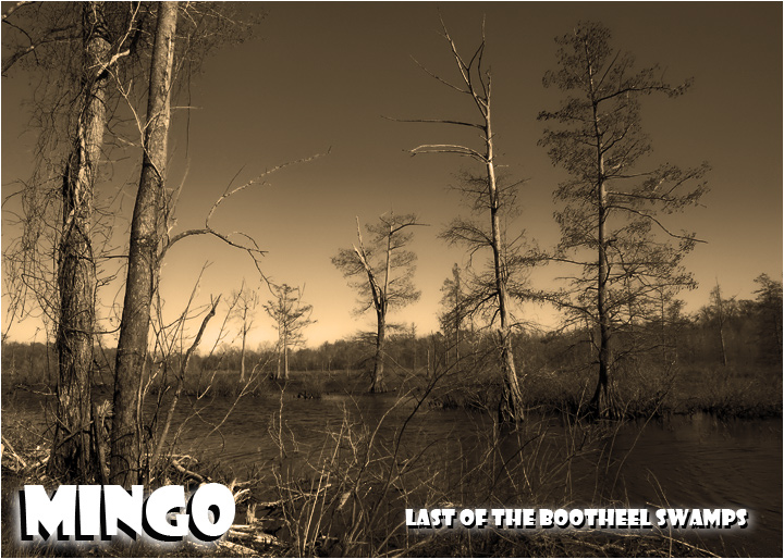
I don't like the B&W / sepia tone on this one, and I think for postcards in general colourful is better.
The shot itself lacks anything substantial, which again could be down to the sepia making the water blend in with the other foreground objects. |
|
 Photographer found comment helpful. Photographer found comment helpful. |
|
|
04/10/2009 08:40:39 AM |
| Certainly a big draw for tourists. I'll bet you had a hard time getting this shot without the crowds in the way. Nice treatment of the scene. |
|
| Photographer found comment helpful. |
|
|
04/09/2009 07:45:52 AM |
Not voting, only commenting:
Wonderful location, nicely captured and post-processed. Terrible font choice! :-) |
|
| Photographer found comment helpful. |
|
|
04/08/2009 02:11:32 PM |
| maybe a different location? |
|
| Photographer found comment helpful. |
|
|
04/07/2009 07:48:16 AM |
| The photo could have been more interesting. |
|
| Photographer found comment helpful. |
|
|
04/07/2009 03:01:05 AM |
| I believe you - don't know what it means though. Must be in the US, because that's where people would presume you know and not bother to explain. |
|
| Photographer found comment helpful. |
|
|
04/07/2009 01:57:50 AM |
| Nice. Good invitation to come take a look. |
|
| Photographer found comment helpful. |
|
|
04/06/2009 09:59:00 PM |
| the duotone/tritone here just isnt my cup of tea |
|
| Photographer found comment helpful. |
|
|
04/06/2009 03:55:52 PM |
| This is so iconic of SE Missouri - I can't say enough about the way the author handles this image from the font to the overall feel of a great wetlands area. |
|
| Photographer found comment helpful. |
|
|
04/06/2009 01:55:59 PM |
| This is a really nice shot. Originally gave it an 8 but after further review I really like it with color and all. |
|
| Photographer found comment helpful. |
|
|
04/06/2009 06:13:47 AM |
| Dont know where Mingo is and would like to. I do like the editing but its all a little blended together to make out any detail. |
|
| Photographer found comment helpful. |
|
|
04/05/2009 10:54:17 PM |
| Nice photo, but I feel the font style with the widw glow detract from the image. |
|
| Photographer found comment helpful. |
Home -
Challenges -
Community -
League -
Photos -
Cameras -
Lenses -
Learn -
Help -
Terms of Use -
Privacy -
Top ^
DPChallenge, and website content and design, Copyright © 2001-2025 Challenging Technologies, LLC.
All digital photo copyrights belong to the photographers and may not be used without permission.
Current Server Time: 04/07/2025 12:54:41 AM EDT.