| Author | Thread |
Comments Made During the Challenge  |
|
|
05/25/2004 04:37:40 PM |
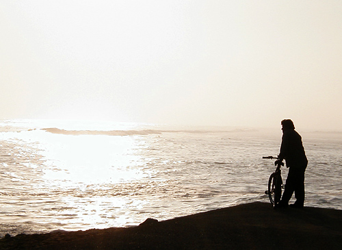
| rflection of sun is a bit too washed out for my liking. |
|
|
|
05/25/2004 09:41:53 AM |
| This is nice and emotive. I just think I would have liked to have seen the bike from sideways on. |
|
|
|
05/21/2004 05:49:59 AM |
| Lovely! Crop a little more empty sky off the top, for a more dynamic horizontal composition, and it would be perfect. Still, you get an 8 from me! |
|
|
|
05/21/2004 05:38:44 AM |
| A very nice silhouette well composed. The slanting line from bottom left leading you up to the biker is perfect. Sepia effect works. Water in the sunlit area is blown out a bit and the sky doesn't do much for you but makes an effective negative space. |
|
|
|
05/19/2004 03:05:55 PM |
| Nice sillouette, but perhaps better if the sky were not blown out. Expose for the sun and sky, if you didn't already do that. Or try to intentionally underexpose and do the adjustments in PS. |
|
|
|
05/18/2004 08:43:25 PM |
| would like to have a little more contrast on the horizon. Nice shadows and content |
|
Home -
Challenges -
Community -
League -
Photos -
Cameras -
Lenses -
Learn -
Help -
Terms of Use -
Privacy -
Top ^
DPChallenge, and website content and design, Copyright © 2001-2025 Challenging Technologies, LLC.
All digital photo copyrights belong to the photographers and may not be used without permission.
Current Server Time: 04/06/2025 09:11:48 PM EDT.