| Author | Thread |
Comments Made During the Challenge  |
|
|
03/17/2009 12:46:36 PM |
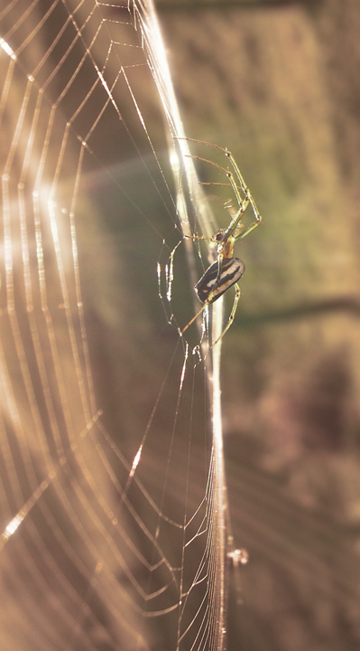
| Lighting here is a bit harsh, but framing and subject are great. |
|
|
|
03/16/2009 11:50:25 PM |
| It's a shame about the flare (& ghosting?) |
|
|
|
03/16/2009 07:53:09 PM |
|
|
|
03/16/2009 05:51:04 PM |
|
|
|
03/16/2009 04:59:07 PM |
| Very nice POV. Makes the photo very interesting. |
|
|
|
03/16/2009 04:22:30 PM |
| Like the colours. The composition feels off balance in the vertical orientation. Putting it horizontal with the edge of the web along the diagonal I think would make it feel more balanced. |
|
|
|
03/16/2009 12:09:53 PM |
Yuck, spider Quick kill it..
like the strong backlighting and the touch of flare... |
|
|
|
03/16/2009 11:41:27 AM |
| Very cool shot. The spider looks awesome. Wish the rest was a little bit clearer. |
|
|
|
03/15/2009 02:55:35 PM |
| I think its the sun but there's too much of a soft element to this |
|
|
|
03/15/2009 02:48:13 PM |
| Nice POV on the spider, I'm guessing you didn't use a lens hood as the light reflections affected the contrast in the image. |
|
|
|
03/15/2009 12:12:22 PM |
| Image is a bit light but a nice shot. |
|
|
|
03/15/2009 10:34:04 AM |
| seems just a little overexposed |
|
|
|
03/15/2009 06:59:56 AM |
| Nice photo, Spider could have been just a bit sharper |
|
|
|
03/15/2009 05:26:51 AM |
| a bit flat, need contrast and better sharpness - 5 |
|
|
|
03/15/2009 02:38:40 AM |
| Unnatural looking somehow. Must be due to the processing. |
|
|
|
03/15/2009 01:20:02 AM |
unusual picture , I like the light yet maybe bit less exposed or higher contrast would be better (for me ;)
I give 7(or 8? :D we'll see...
brano |
|
|
|
03/14/2009 07:08:18 PM |
| Neat perspective and a cool find. Photo seems over exposed and washed out, though. |
|
|
|
03/14/2009 06:56:35 PM |
|
|
|
03/14/2009 05:45:32 PM |
| neat the way you caught the sunlight |
|
|
|
03/14/2009 05:36:50 PM |
| And he's keeping an eye on you! |
|
|
|
03/14/2009 03:59:43 PM |
| I really like the composition in this. However, it seems a bit overexposed, which can work sometimes, but I find myself looking at it wanting to see a bit more definition on the spider. It kinda looks like I am looking through glass. |
|
|
|
03/14/2009 03:34:34 PM |
| Looks like this was shot through a window.. too soft overall |
|
|
|
03/14/2009 12:13:13 PM |
| I like the composition a lot. |
|
|
|
03/14/2009 11:46:36 AM |
| Cool shot using the natural light. Good composition. |
|
|
|
03/14/2009 11:34:39 AM |
|
|
|
03/14/2009 08:04:20 AM |
| Post processing could have been done a little differently. Insufficient contrast to me. Inroduce darker tones into this shot while keeping the highlights and see if you like it more, 6 |
|
|
|
03/14/2009 01:03:21 AM |
| I like the rays of light coming through |
|
|
|
03/13/2009 08:18:48 PM |
|
|
|
03/13/2009 09:32:44 AM |
| Spiders are pretty hard to photograph well. You've got a good subject here. A bit more contrast would show him(her) off to better advantage. |
|
|
|
03/13/2009 09:16:55 AM |
| The soft hues and highlights really play of this sharp image extremely well! |
|
|
|
03/13/2009 06:24:16 AM |
| Nice light. I like your PoV. |
|
|
|
03/13/2009 04:37:09 AM |
| A little flat in focus and color but very nice subject! |
|
|
|
03/12/2009 11:56:54 AM |
| too light/needs contrast! |
|
|
|
03/12/2009 11:27:18 AM |
|
|
|
03/12/2009 06:00:04 AM |
| She dances lightly on her silken ballroom. |
|
|
|
03/12/2009 04:17:42 AM |
| Its well taken but the way the web is catching all the light distracts from the well focused spider |
|
|
|
03/12/2009 03:27:11 AM |
| Wow, love this one, and in my opinion if the picture could be tilted a little would add to it. Unfortunately the flare is not helping here. Even so, an amazing picture. |
|
|
|
03/12/2009 01:28:57 AM |
| Good shot although a darker background would have highlighted the spider much more. |
|
|
|
03/11/2009 08:35:29 PM |
|
|
|
03/11/2009 07:24:19 PM |
| Good composure, but I think the shot could have benefited from a little extra processing (even if it was just Auto-Levels). |
|
|
|
03/11/2009 05:36:14 PM |
| your colors and tones are flat/dull...did you do curves/levels? |
|
|
|
03/11/2009 03:28:47 PM |
| Very interesting, I like the detail you were able to capture on the spider. I would have liked it better with a little more contrast, but that's just my opinion. |
|
|
|
03/11/2009 03:07:24 PM |
| Im not a big fan of spiders, but this is a good shot. I like your choice of angle, to capture a bit of the web in focus. |
|
|
|
03/11/2009 02:00:10 PM |
| The lighting is washing the photo out a little. Immediately when I looked at your photo, I thought "I bet this would rock in B&W". If you converted it, the lighting would probably make the spider stand out more. Cool photo though! |
|
|
|
03/11/2009 12:27:54 PM |
| Picture looks very faded. Some contrast and sharpening would help. |
|
|
|
03/11/2009 08:15:01 AM |
| I really like this. The colors are beautiful! |
|
|
|
03/11/2009 07:09:41 AM |
| Feels a little flat overall. |
|
|
|
03/10/2009 11:23:04 PM |
| cool capture, need a bit more contrast |
|
Home -
Challenges -
Community -
League -
Photos -
Cameras -
Lenses -
Learn -
Help -
Terms of Use -
Privacy -
Top ^
DPChallenge, and website content and design, Copyright © 2001-2025 Challenging Technologies, LLC.
All digital photo copyrights belong to the photographers and may not be used without permission.
Current Server Time: 04/07/2025 02:19:38 AM EDT.