| Author | Thread |
|
|
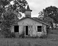
08/16/2004 01:02:50 PM |
| This is an awesome shot. I really like the tones here and the peacefulness of the shot. |
|
 Photographer found comment helpful. Photographer found comment helpful. |
|
|
05/26/2004 10:05:56 PM |
| Cant belive I was the only one who gave it a 10, its perfect in its unperfection the unperfection being the little things that are bugging some people like the thing around here But I agree with Jacko, I think it makes the shot, This was highly underrated, Keep up the good work, look forward to see more stuff from you :) |
|
| Photographer found comment helpful. |
Comments Made During the Challenge  |
|
|
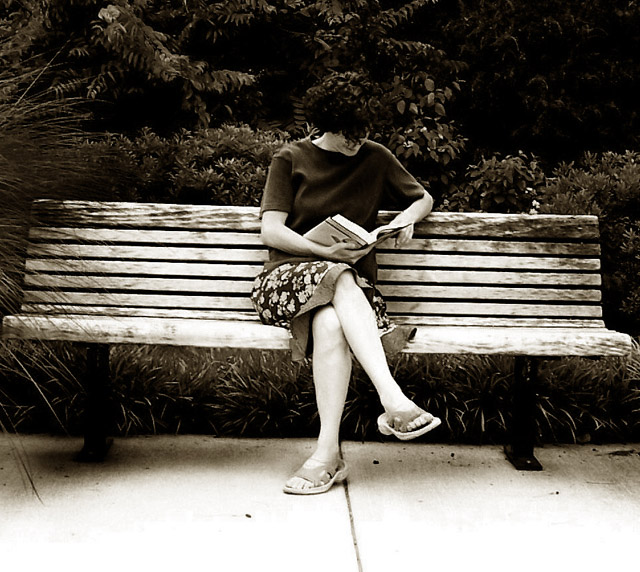
05/22/2004 08:53:34 PM |
Two things: 1) It's tilted to the right. Looks like she is going to slide right off the end of the bench. 2) You should have cropped it a little so the frame is more portrait. That would fit better with the person and also not show the ends of the bench. The B&W/Sepia is nice.
|
|
| Photographer found comment helpful. |
|
|
05/21/2004 03:21:36 PM |
| May have helped levelling this shot. But lovely anyway , nice use of destauration. |
|
| Photographer found comment helpful. |
|
|
05/19/2004 10:10:29 AM |
This works well in b/w as it helps to isolate the subject from the background.
You have a nice tonal range in the image as well. |
|
| Photographer found comment helpful. |
|
|
05/18/2004 10:27:47 PM |
| Very nice calm looking situation. Nice Capture. I might have brought the levels just a little bit on the bushes behind your subject to throw a little more emphasis on the person as a whole. The bright legs and arms stand out nicely in this shot. The dark top goes well against the bench but seems to disappear along with the subjects hair around bushes. Still an well composed shot. |
|
| Photographer found comment helpful. |
|
|
05/18/2004 08:18:08 PM |
| Nice. I like how the surrounding elements framet he subject. Good work. Jacko. 8 |
|
| Photographer found comment helpful. |
|
|
05/17/2004 07:26:12 PM |
| Nice "human scene" and use of B & W. I think it could be improved with straightening and more of a central theme of interest. No real focus for me. |
|
| Photographer found comment helpful. |
|
|
05/17/2004 05:54:24 PM |
| To my eye, you've taken this slightly too far in contrast, and certainly in the decision not to rotate the shot to keep the bench horizontal. There are areas where the light is entrancing - around the left leg of the bench for example, but otherwise it seems to bluntly a dull portrait. |
|
| Photographer found comment helpful. |
|
|
05/17/2004 02:54:13 PM |
| really like the b&w and the composition -- wish the blench was level |
|
| Photographer found comment helpful. |
|
|
05/17/2004 10:19:15 AM |
| I love this picture, got some great mood in it and I like the high contrast in it too, I gave it a top score! and I just noticed it has the same title as my last entry :-) |
|
| Photographer found comment helpful. |
|
|
05/17/2004 09:14:59 AM |
| Feels like the exposure balance between foreground and background is a bit off. I think tilting the image would also improve it a bit. |
|
| Photographer found comment helpful. |
Home -
Challenges -
Community -
League -
Photos -
Cameras -
Lenses -
Learn -
Help -
Terms of Use -
Privacy -
Top ^
DPChallenge, and website content and design, Copyright © 2001-2026 Challenging Technologies, LLC.
All digital photo copyrights belong to the photographers and may not be used without permission.
Current Server Time: 02/01/2026 09:06:20 AM EST.