| Author | Thread |
Comments Made During the Challenge  |
|
|
02/22/2009 10:11:46 PM |
| Colors seem a little dull. I think this could have been better. IMO. |
|
 Photographer found comment helpful. Photographer found comment helpful. |
|
|
02/22/2009 02:56:57 PM |
| That is what I am saying...lol |
|
| Photographer found comment helpful. |
|
|
02/21/2009 02:35:24 AM |
| Exactly, "What"? I am not reading all that.;o) Sorry, I didn't get it. |
|
| Photographer found comment helpful. |
|
|
02/20/2009 10:36:21 AM |
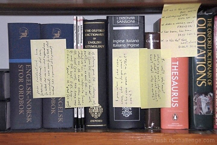
| seems a little grainy, kind of hard to read the post-its... |
|
| Photographer found comment helpful. |
|
|
02/17/2009 12:10:12 PM |
| Composition is rather bland. The direct lighting is too harsh. |
|
| Photographer found comment helpful. |
|
|
02/17/2009 12:04:41 PM |
| etymology - cool! I like that stuff :) 8 |
|
| Photographer found comment helpful. |
|
|
02/16/2009 10:38:17 AM |
| I think it would look better a little darker--seems pretty light... |
|
| Photographer found comment helpful. |
|
|
02/16/2009 04:14:38 AM |
|
| Photographer found comment helpful. |
|
|
02/16/2009 12:18:20 AM |
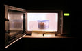
| interesting subject - horrible lighting - very harsh. |
|
| Photographer found comment helpful. |
Home -
Challenges -
Community -
League -
Photos -
Cameras -
Lenses -
Learn -
Help -
Terms of Use -
Privacy -
Top ^
DPChallenge, and website content and design, Copyright © 2001-2026 Challenging Technologies, LLC.
All digital photo copyrights belong to the photographers and may not be used without permission.
Current Server Time: 02/01/2026 11:45:30 AM EST.