| Author | Thread |
|
|
02/04/2005 05:00:10 PM |
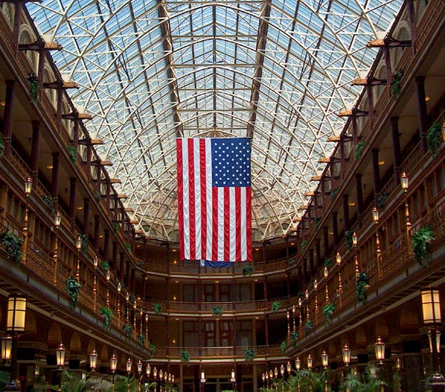
| Thanks for including the link to this in your comment of my photo. This is beautiful and certainly deserved a much better score. The symmetry is great and I love the pattern of lanterns along the side. The flag is crisp and beautiful. Thanks for sharing it. |
|
 Photographer found comment helpful. Photographer found comment helpful. |
|
|
06/09/2004 01:46:04 PM |
Just going back to leave comments on some challenges I voted on, but didn't have time to comment.
I wanted to comment on this because I felt it was better than your score showed. I gave it an 8. The centering is what gives this photo it's strength, and I thought it was perfect for the challenge. Interesting lines, nice jolt of color with the flag and the exposure was good too. With that skylight, I'm glad you were able to not overexpose the window area, but still pick up the details of the inside area. Nicely done! |
|
| Photographer found comment helpful. |
|
|
05/31/2004 11:40:04 PM |
| I gave this a 7.. I really liked it. I think the score suffered simply because of anti-American sentiment, which is just really too bad, because it is very well done. |
|
| Photographer found comment helpful. |
|
|
05/30/2004 09:05:57 PM |
This is actually quite a good interior, architectural shot. I would ignore the ones, twos, and threes---wierdness. Your subject is quite obviously centered so there is no real exuse for giving this photo less than a five. I probably would have scored it higher than five personally. I didn't vote on all the centered challenges and didn't see this one.
|
|
| Photographer found comment helpful. |
|
|
05/24/2004 07:51:09 AM |
| 9 ones? I know this is not the best shot in the world, but give me a break, if you dont like a photo so much to give it a one, please at least give me a comment. |
|
Comments Made During the Challenge  |
|
|
05/22/2004 11:25:17 PM |
| This is simply a well done interior shot! The flag gives you a strong visual center and adds some perspective to the interior size. Minor technical details include the flag behind the US flag which is a tad distracting, and the light on the right going through another light. That throws the "center" off a bit. I would have considered cropping those lights out. Solid 7. Nice! |
|
| Photographer found comment helpful. |
|
|
05/22/2004 10:04:45 PM |
| Awesome shot! The flag really stands out nicely in front of the dark building and skylight. |
|
| Photographer found comment helpful. |
|
|
05/21/2004 05:57:26 AM |
| very clever image nice detail and fits the challenge well |
|
| Photographer found comment helpful. |
|
|
05/20/2004 01:42:42 PM |
| Great composition - I like the way the flag's bright colors stand out from the detailed, but almost monochromatic surroundings. Nice composure, and very well balanced! |
|
| Photographer found comment helpful. |
|
|
05/18/2004 10:52:40 PM |
| Very nice shot, a lot of detail here but it all draws/pushes me to the center. High marks (and not because I'm a former jarhead). Wish there was just a tad more sharpness to this, but that is most likely due to stuff a lot of detail in a 640x640 area. Bet the original is spectacular. Great job. |
|
| Photographer found comment helpful. |
|
|
05/18/2004 08:58:12 PM |
| Nice overall effort. Colors and lighting seem good. My complaints: 1. camera is not level; 2. symmetry is slightly off center; 3. there is another flag behind the US flag and is distracting; 4. focus is a bit off. |
|
|
|
05/17/2004 10:55:43 PM |
| Great use of leading lines and the exposure it right on. It feels like it may be ever so slightly rotated to the left but that may just be an illusion. Nice Job! |
|
| Photographer found comment helpful. |
|
|
05/17/2004 10:48:58 PM |
| I predict a bunch of protest votes... too bad cuz it's a great picture. The flag is nicely more-saturated than the rest to make it stand out from the busy background. good stuff! |
|
| Photographer found comment helpful. |
|
|
05/17/2004 05:08:01 PM |
| Great shot, almost perfectly symmetrical. Very arresting image. Some great colours, especially in the skylights. |
|
| Photographer found comment helpful. |
|
|
05/17/2004 11:00:40 AM |
| This image seems to compete with itself a little. I know you framed it as such to put the flag in the center, but I can't help but want to have the floor included in the shot (which would make the flag off center). Looks like a very cool place. |
|
| Photographer found comment helpful. |
|
|
05/17/2004 12:54:50 AM |
| This is perfect for this challenge. Well done! The lines leading the eye right into the center are great, and the flag is dead-on center. Not to mention the great mood and inspiring message. |
|
| Photographer found comment helpful. |
Home -
Challenges -
Community -
League -
Photos -
Cameras -
Lenses -
Learn -
Help -
Terms of Use -
Privacy -
Top ^
DPChallenge, and website content and design, Copyright © 2001-2026 Challenging Technologies, LLC.
All digital photo copyrights belong to the photographers and may not be used without permission.
Current Server Time: 02/01/2026 08:48:36 AM EST.