| Author | Thread |
Comments Made During the Challenge  |
|
|
05/18/2004 07:36:54 PM |
|
 Photographer found comment helpful. Photographer found comment helpful. |
|
|
05/18/2004 07:20:58 PM |
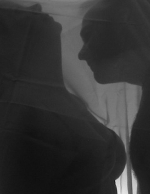
| An interesting shot. I think it would have succeeded far better with an ironed sheet - the textures and shadows are really nice. The lighting was well done. |
|
| Photographer found comment helpful. |
|
|
05/18/2004 07:26:26 AM |
| Poor image quality, but a GREAT foto!!! |
|
| Photographer found comment helpful. |
|
|
05/17/2004 04:20:27 PM |
|
| Photographer found comment helpful. |
|
|
05/17/2004 01:09:22 PM |
| i like the use of the veil. |
|
| Photographer found comment helpful. |
|
|
05/17/2004 05:31:56 AM |
| The wrinkles on the screen are very distracting. There's a lot of mood in this shot, but I feel like there's not enough contrast. |
|
| Photographer found comment helpful. |
|
|
05/16/2004 05:31:24 AM |
| Nice shot, but I'm not feeling it for the challenge. |
|
| Photographer found comment helpful. |
|
|
05/14/2004 06:38:29 PM |
| Good shot on the challenge. To make this really have impact, the people need to be completly in shadow. Either a stronger light behind, or perhaps move the sheet/curtain between them and the camera. There's just enough detail that it distracts from the opposites theme. 9 |
|
| Photographer found comment helpful. |
|
|
05/12/2004 08:38:12 PM |
| A little flat. Some more contrast would be great. 5 |
|
| Photographer found comment helpful. |
|
|
05/12/2004 07:20:55 PM |
| Nice idea, classy look and style. The wrinkles in the sheet really detract from the mystery and purity that's being attempted here. |
|
| Photographer found comment helpful. |
|
|
05/12/2004 09:18:22 AM |
| This seems very out of focus and a bit grainy. I'm not sure how you'd fix it, but it's a tiny bit distracting. However, I can tell you put a lot of work into this and it's a great idea for this challenge -7 |
|
| Photographer found comment helpful. |
|
|
05/11/2004 11:16:12 PM |
| nicely translated in sillouette goooood job |
|
| Photographer found comment helpful. |
Home -
Challenges -
Community -
League -
Photos -
Cameras -
Lenses -
Learn -
Help -
Terms of Use -
Privacy -
Top ^
DPChallenge, and website content and design, Copyright © 2001-2025 Challenging Technologies, LLC.
All digital photo copyrights belong to the photographers and may not be used without permission.
Current Server Time: 04/07/2025 02:20:52 PM EDT.