| Author | Thread |
Comments Made During the Challenge  |
|
|
05/18/2004 04:41:11 PM |
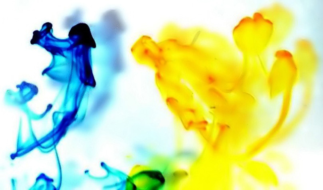
| Beautiful abstract shapes and color. I like the wide ratio of the photo and the choice of the slight green blending at the bottom of the center. |
|
 Photographer found comment helpful. Photographer found comment helpful. |
|
|
05/18/2004 03:44:19 PM |
| beautiful... but what the hell is it! Ink? Paint? |
|
| Photographer found comment helpful. |
|
|
05/18/2004 09:37:31 AM |
|
| Photographer found comment helpful. |
|
|
05/17/2004 01:15:13 PM |
|
| Photographer found comment helpful. |
|
|
05/16/2004 11:55:27 PM |
|
| Photographer found comment helpful. |
|
|
05/16/2004 02:36:03 AM |
| Interesting, nice high key - and would make a good image for the reception area of an office building. But dummy me, I just don't get much "opposite" - even tho the primary colors are complimentary on a color wheel. |
|
| Photographer found comment helpful. |
|
|
05/14/2004 10:28:16 PM |
| I'm not sure about opposites, but the pic rocks. I'd really like to know your technique on this. |
|
| Photographer found comment helpful. |
|
|
05/14/2004 09:01:44 PM |
| I tried but couldn't see what's opposite here. If it's opposite colors on the color wheel, then I'm afraid I miss that boat because I don't know which colors are opposite. That said, the image doesn't hold too much visual interest for me. |
|
| Photographer found comment helpful. |
|
|
05/14/2004 11:36:36 AM |
| This is a bit abstract and unsharp for my liking. It is creative though. |
|
| Photographer found comment helpful. |
|
|
05/14/2004 10:47:00 AM |
| Hummmmmm, not really seeing the opposite of the shot, interesting idea though but needs a bit more definition. The shadows are distracting. A 3 |
|
| Photographer found comment helpful. |
|
|
05/14/2004 06:26:39 AM |
I do not see opposites here.
The right-hand side is too blurry |
|
| Photographer found comment helpful. |
|
|
05/13/2004 03:31:44 PM |
| Cool picture, I don't understand what the opposite is ? |
|
| Photographer found comment helpful. |
|
|
05/13/2004 12:39:19 PM |
| I like this photo! I like the blown out whites too! |
|
| Photographer found comment helpful. |
|
|
05/13/2004 10:22:58 AM |
I can't make out what is opposite here.
Sorry.
The smoke looks good and the colors are good though.
Edit-yelow and blue are opposite!!!! |
|
| Photographer found comment helpful. |
|
|
05/12/2004 09:44:58 PM |
| neat ... I'de love to know how you did this. |
|
| Photographer found comment helpful. |
|
|
05/12/2004 08:59:54 PM |
| Great colors. What is that? |
|
| Photographer found comment helpful. |
|
|
05/12/2004 03:44:43 PM |
| This would be a great entry for "abstract", but I'm not sure I see the opposites theme here. Ah, blue and yellow...opposites on the color wheel, I suppose. Okay, up one rating for that! |
|
| Photographer found comment helpful. |
|
|
05/12/2004 02:26:43 PM |
| OK, I know that yellow and blue are primary colors that together make green...but what exactly is the opposite concept in this shot? It is an interesting abstract, and I like the colors and shapes, but IMHO it doesn't meet the challenge. |
|
| Photographer found comment helpful. |
Home -
Challenges -
Community -
League -
Photos -
Cameras -
Lenses -
Learn -
Help -
Terms of Use -
Privacy -
Top ^
DPChallenge, and website content and design, Copyright © 2001-2026 Challenging Technologies, LLC.
All digital photo copyrights belong to the photographers and may not be used without permission.
Current Server Time: 02/01/2026 10:35:52 AM EST.