| Author | Thread |
|
|
06/04/2004 10:18:04 PM |
| Really good street shot. Very subtle. Maybe too subtle for a challenge unfortunately. People don't tend to spend a lot of time looking for subtleties when they vote. |
|
Comments Made During the Challenge  |
|
|
05/18/2004 07:49:55 PM |
Really a good find for the challenge. I hope people will look long enough to see....
? Good job but may be too subtle. |
|
 Photographer found comment helpful. Photographer found comment helpful. |
|
|
05/18/2004 04:58:33 PM |
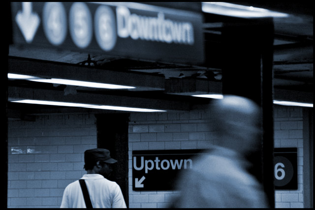
| Great concept, fantastic angle, and the blur of moving person in the foreground opposed to the still figure in the background all lend this shot a good number. But since your main focus is on the text in the picture, a greater depth of field would have been appreciated, creating a greater legibility of "downtown". |
|
| Photographer found comment helpful. |
|
|
05/18/2004 09:41:24 AM |
| I like it! You've nicely contrasted black/white, up and downtown, foreground/background and blur and focus. 8 |
|
| Photographer found comment helpful. |
|
|
05/17/2004 01:21:53 AM |
| Subtle opposites, nice composition. |
|
|
|
05/15/2004 09:08:39 PM |
| Try t get both signs in focus. Good idea for the challenge. |
|
|
|
05/15/2004 10:19:44 AM |
Great idea, the composition is good, lighting ok and duotoning (I guess) very good. I think that if the man in front hadn't been there that a square composition (the right cut off) might have worked stronger.
Shame that the dowtown sign is out of the field of focus. A smaller aperture (+bumped up ISO to not let the motion blur get out of hand) would have helped here. Choosing a nearer focus point sometimes does the trick as well.
|
|
| Photographer found comment helpful. |
|
|
05/13/2004 05:45:09 PM |
|
|
|
05/13/2004 12:36:03 PM |
| Wow, this is one of my favorite so far of the challenge. Good job, hope you place high! |
|
|
|
05/13/2004 11:24:48 AM |
| two things that would have made this a stronger shot. If the white guy was walking in the other direction, it would have compleated the opposition. If the downtown sign was more firmly in the frame it would have given it more power to balance out the softness of focus, as it is it has less impact than the uptown sign, where as the two figures balance very nicely because of their solid placment in the frame. Nice to see a non studio/ posed shot here. |
|
| Photographer found comment helpful. |
|
|
05/13/2004 03:20:43 AM |
I like this shot it has city ...soul The Blue hue works for me the focus unfocus/movement works uptown downtown is great.
How about bald and capped
The arrows ... In my Top ten I give it an 8
Sorry your score won't change I voted on this right on opening but commented today. |
|
| Photographer found comment helpful. |
|
|
05/12/2004 08:19:14 PM |
| Very nice; wish the word downtown was more in focus. Good eye. |
|
| Photographer found comment helpful. |
|
|
05/12/2004 07:32:09 PM |
| Very interesting shot. I enjoy your DOF and courage to leave Downtown out of focus. The color choice is great. |
|
| Photographer found comment helpful. |
|
|
05/12/2004 02:11:14 PM |
Besides uptown and downtown there is motion and rest, focus and blur, light and dark, hatless and covered, bald and not. I think the challenge has been well met. The photo has a lot of appeal for me as well as my eyes keep going to the interest that the man with shoulder strap and hat is showing in the uptown sign. Excellent composition and exposure.
A 9. |
|
| Photographer found comment helpful. |
|
|
05/12/2004 01:42:48 PM |
| Good catch!!! I wish the focus could have been keppt a bit better. |
|
|
|
05/12/2004 12:10:59 PM |
| Excellent! My pick for Blue Ribbon. My suggestion: keep it up. |
|
|
|
05/12/2004 01:34:59 AM |
Very nice, I would prefer for both the uptown and dowtown to be visible.
Great idea. 7 |
|
Home -
Challenges -
Community -
League -
Photos -
Cameras -
Lenses -
Learn -
Help -
Terms of Use -
Privacy -
Top ^
DPChallenge, and website content and design, Copyright © 2001-2026 Challenging Technologies, LLC.
All digital photo copyrights belong to the photographers and may not be used without permission.
Current Server Time: 02/01/2026 08:59:22 AM EST.