| Author | Thread |
Comments Made During the Challenge  |
|
|
05/15/2004 01:38:28 PM |
|
 Photographer found comment helpful. Photographer found comment helpful. |
|
|
05/15/2004 09:42:12 AM |
|
| Photographer found comment helpful. |
|
|
05/15/2004 09:27:00 AM |
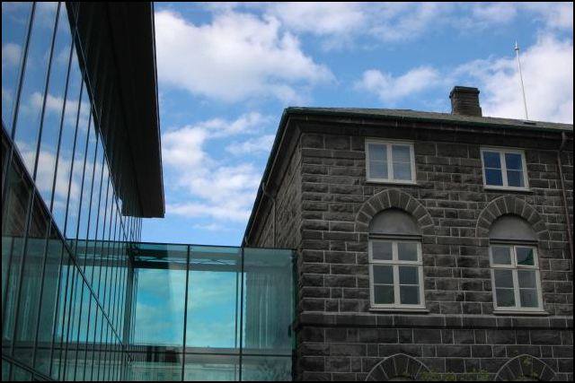
| Nicely done - your title helps. The new international-style glass structure and the old (gothic? romanesque?) building do provide an intersting contrast. Silly architect. The image seems a bit dark - the brightest objects are the clouds, which, in my opinion, don't stay in the background where they belong. |
|
| Photographer found comment helpful. |
|
|
05/14/2004 09:18:47 AM |
Meets the challenge, they are opposite types of buildings in many different ways. The shot itself leaves me wanting more POP, more wow. For a shot like this, with the glass and the blue sky I personally would expect to see much deeper colors and contrast, not sure why. Also the angle of the shot seems just off with the lines coming off at odd angles from the side of the picture. If you could have gotten a bit higher to balance that out more. Not sure if that was possible or not but if so maybe you could try again?
As the shot stands, I started it a 3 but am going to raise it to a 5 |
|
| Photographer found comment helpful. |
|
|
05/14/2004 06:17:38 AM |
| Looks like the image is tilted clockwise by 1-2 degrees. It's also a bit dark for my liking, and would benefit from sharpening. |
|
| Photographer found comment helpful. |
|
|
05/13/2004 10:45:03 AM |
| exposure is for the sky and the shadows are lacking details |
|
| Photographer found comment helpful. |
|
|
05/13/2004 09:02:09 AM |
| Himininn er flottur en mér fynnst eins og alþingishúsið sé soldið dökkt. Góð hugmynd. |
|
| Photographer found comment helpful. |
|
|
05/13/2004 08:53:56 AM |
| Hey this is pretty cool, I like the way the old building and the new building just run together. |
|
| Photographer found comment helpful. |
|
|
05/12/2004 09:54:48 PM |
| beautiful! Love the combination of reflection and translucense. |
|
| Photographer found comment helpful. |
|
|
05/12/2004 09:27:18 PM |
| nice clouds and reflection of them in the glass, but I think the subject is supposed to be the buildings. If you expose for the buildings they shouldn't end up so flat. 4 |
|
| Photographer found comment helpful. |
|
|
05/12/2004 05:54:20 PM |
| Thats cool but needs less sky in the image, it should be more about the buildings and the architecture. |
|
| Photographer found comment helpful. |
|
|
05/12/2004 03:19:35 PM |
| góð hugmynd. er bara ekki alveg að virka |
|
|
|
05/12/2004 01:13:51 PM |
| great idea--nice composition--nice sky background--and reflections on glass...lighting could have been improved.........8 |
|
| Photographer found comment helpful. |
|
|
05/12/2004 12:26:05 PM |
| A wonderful and original interpretation for the challenge. The choice of framing really highlights the differences. I like the colors, especially the differences between the aqua of the glass and the blue of the sky and then the reflected sky in the left windows. I wonder if a slight rotation CCW wouldn't help to make the line of the walkway feel a little better. |
|
| Photographer found comment helpful. |
|
|
05/12/2004 09:13:20 AM |
| Appears a tad fuzzy and flat on my monitor. Interesting concept, new and old. Would love to see this with light on the front of the buildings. |
|
| Photographer found comment helpful. |
|
|
05/12/2004 05:22:18 AM |
| Great idea - but I think this could have been taken from a different perspective to provide more impact. |
|
| Photographer found comment helpful. |
|
|
05/12/2004 02:57:37 AM |
| nice shot. solid and in focus |
|
| Photographer found comment helpful. |
Home -
Challenges -
Community -
League -
Photos -
Cameras -
Lenses -
Learn -
Help -
Terms of Use -
Privacy -
Top ^
DPChallenge, and website content and design, Copyright © 2001-2025 Challenging Technologies, LLC.
All digital photo copyrights belong to the photographers and may not be used without permission.
Current Server Time: 04/07/2025 01:02:59 PM EDT.