| Author | Thread |
Comments Made During the Challenge  |
|
|
05/17/2004 02:52:56 PM |
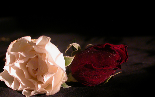
| Might have been better if the subject was more centrally framed since I'm not sure the darkness in the background really adds to the picture |
|
|
|
05/17/2004 02:32:09 AM |
some areas blown out or overexposed.(highlight edges of pink flowers)
Good idea though and good effort
|
|
|
|
05/16/2004 05:26:45 AM |
| Very nice, lighting is harsh (dark on one side and blown out on the other) and I like it that way... good job! |
|
|
|
05/14/2004 08:01:52 AM |
| Background rose is underexposed and blends too much with the background. |
|
|
|
05/12/2004 05:21:02 PM |
| good use of light, but mabye a little to hot on the side of the pink rose, should have bounced more on to the red rose. |
|
|
|
05/12/2004 04:10:12 PM |
| Nice concept...lighting is a bit harsh on the white flower; contrast a bit too dark for great detail in the red. Would like to see this again with a bit better lighting. It has potential. :o) |
|
|
|
05/12/2004 09:25:43 AM |
| so dark I can't hardly see the second rose. kind of blurry. |
|
|
|
05/12/2004 09:07:36 AM |
I might have cropped this one a bit differently - but other than that - this is beautiful!
Love the way the light is strong on the live flower and dull on the dead one - this photo truly fits the category! Very good work! (9) |
|
|
|
05/12/2004 08:38:09 AM |
| This would have been stronger if correctly centered. Good idea. |
|
|
|
05/12/2004 07:36:22 AM |
one's in the pink of health .... the other red-lined .
|
|
|
|
05/12/2004 05:35:32 AM |
| The good rose looks worn not vibrant (life) |
|
|
|
05/11/2004 11:56:04 PM |
| the lighting could be better. i think a weaker, more diffuse light and longer exposure would help. a less reflective black surface would also help. focus, DOF, and sharpness are good. |
|
|
|
05/11/2004 10:17:03 PM |
| it is hard to tell the red rose is dead, and there seems to be too much light |
|
|
|
05/11/2004 08:18:51 PM |
| I'm so glad you're a drunken gay bastard who likes flowers, you pepe. |
|
Home -
Challenges -
Community -
League -
Photos -
Cameras -
Lenses -
Learn -
Help -
Terms of Use -
Privacy -
Top ^
DPChallenge, and website content and design, Copyright © 2001-2025 Challenging Technologies, LLC.
All digital photo copyrights belong to the photographers and may not be used without permission.
Current Server Time: 04/07/2025 12:58:11 PM EDT.