| Author | Thread |
Comments Made During the Challenge  |
|
|
05/18/2004 01:43:44 PM |
|
 Photographer found comment helpful. Photographer found comment helpful. |
|
|
05/18/2004 08:53:33 AM |
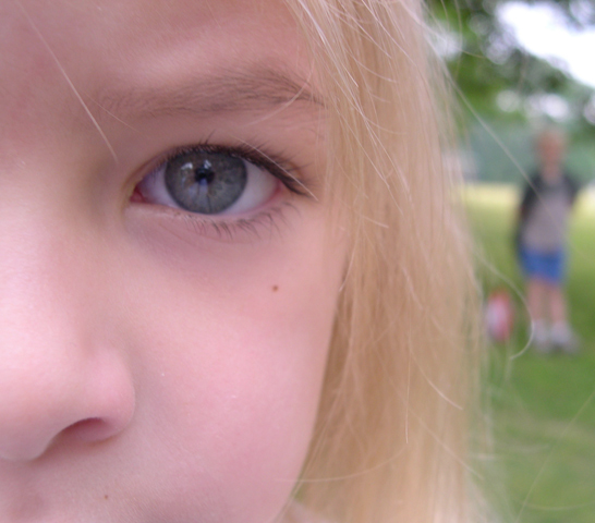
| I like this...I think it could be better by a bit more contrast, it appears a bit bright to me. Also the near subject could be cropped a bit left...I would like to see here see the chop more centered on her and less of a crop on the right as the far subject is too crowded in the frame and maybe just a little more definition on the far subject as well. Great idea! |
|
| Photographer found comment helpful. |
|
|
05/18/2004 08:32:08 AM |
|
| Photographer found comment helpful. |
|
|
05/17/2004 11:28:20 PM |
| I really like this idea. I think a little wider DOF to make the person in the back a little clearer would make it stronger. |
|
| Photographer found comment helpful. |
|
|
05/17/2004 04:13:07 AM |
| This could be a great shot, but I feel its just a little to soft. I'd say work on it and you'll have a winner... good job on the idea! |
|
| Photographer found comment helpful. |
|
|
05/17/2004 01:56:44 AM |
| more DOF would have illustrated the point better. |
|
| Photographer found comment helpful. |
|
|
05/15/2004 10:26:07 AM |
| Very nice handling of your extreme depth of field. Great exposure on the close face - and a pretty one at that. The hair coming in from the top left leading you down to the eye is a GREAT touch. There are two suggestions for improvement: 1) The bight sky in the top right corner is unfortunate and 2) The reddish object to the left of the legs is a minor detractor. |
|
| Photographer found comment helpful. |
|
|
05/14/2004 08:32:02 PM |
| Love the idea! Background subject is too far out of focus. I would have tried a higher f-stop. |
|
| Photographer found comment helpful. |
|
|
05/14/2004 12:51:30 PM |
| Background is too out of focus - ditracting. Foreground feels washed out. |
|
| Photographer found comment helpful. |
|
|
05/13/2004 10:34:28 PM |
| ood lighting and good composition |
|
| Photographer found comment helpful. |
|
|
05/13/2004 12:44:03 PM |
| I think this would have worked better with a deep depth of field so that both subjects were in focus. |
|
| Photographer found comment helpful. |
|
|
05/13/2004 05:40:07 AM |
| Really nice image of opposites...I like the idea and the composition. |
|
| Photographer found comment helpful. |
|
|
05/13/2004 12:59:34 AM |
| increase DOF to bring rear subject into a little sharper focus, but not much. |
|
| Photographer found comment helpful. |
|
|
05/12/2004 03:56:41 PM |
| Very nice! And what beautiful eyes she has. I like your idea and I like the shot, I gave you an 8. |
|
| Photographer found comment helpful. |
|
|
05/12/2004 01:19:24 PM |
| This meets the challenge. The composition and colors are very nice This does not look like it was much fun for the children though. A 4. |
|
| Photographer found comment helpful. |
|
|
05/12/2004 01:00:03 PM |
| Very hard to see the boy in the distance. May have helped to move away just slightly to ensure the boy was not covered by the girl's hair. |
|
| Photographer found comment helpful. |
|
|
05/12/2004 08:09:40 AM |
| Skintone litle strange, too redish (needs more HUE). The eye has to be better focused. Othervise fine image and a good idea |
|
| Photographer found comment helpful. |
|
|
05/12/2004 12:36:23 AM |
| Lovely, simple idea. Nicely done. |
|
| Photographer found comment helpful. |
Home -
Challenges -
Community -
League -
Photos -
Cameras -
Lenses -
Learn -
Help -
Terms of Use -
Privacy -
Top ^
DPChallenge, and website content and design, Copyright © 2001-2026 Challenging Technologies, LLC.
All digital photo copyrights belong to the photographers and may not be used without permission.
Current Server Time: 02/01/2026 09:42:59 AM EST.