| Author | Thread |
Comments Made During the Challenge  |
|
|
01/19/2009 05:28:00 PM |
| Nice idea. I think the effect may have been enhanced if you'd been able to crop off the black space on the top and bottom. |
|
|
|
01/18/2009 11:01:54 AM |
| maybe for an ingredient/glossary page but no "cooking" |
|
|
|
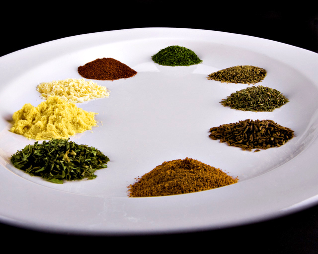
01/15/2009 12:06:46 PM |
| Nice image, but there's something about the angle that doesn't make it as interesting as it could be... Maybe I'd have gone for a much lower angle that made the closer mounds look quite big and the farther ones diminish in size with the distance, creating a bit more perspective. Of course you'd probably need a shallower tray or bigger mounds for that. |
|
 Photographer found comment helpful. Photographer found comment helpful. |
|
|
01/14/2009 06:10:09 PM |
| I really like this image. The colors really make the picture, and it's simple, yet good. 7 |
|
| Photographer found comment helpful. |
|
|
01/14/2009 03:43:37 PM |
| This looks a lot like a painter's palette. It would have been neat to have thrown a paint brush in there too, to emphasize the "art of cooking". :) Very cool. |
|
| Photographer found comment helpful. |
|
|
01/14/2009 09:07:31 AM |
| This is a good photo, perhaps a bit closer to see the detail of the spices? |
|
| Photographer found comment helpful. |
Home -
Challenges -
Community -
League -
Photos -
Cameras -
Lenses -
Learn -
Help -
Terms of Use -
Privacy -
Top ^
DPChallenge, and website content and design, Copyright © 2001-2026 Challenging Technologies, LLC.
All digital photo copyrights belong to the photographers and may not be used without permission.
Current Server Time: 02/01/2026 10:52:40 AM EST.