| Author | Thread |
|
|
01/25/2009 12:40:10 PM |
This is Kari Ann, greetings from the Critique Club:
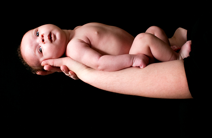
composition: perhaps the arm a little lower in frame would have helped this composition wise. it feels too scrunched to the top
color:the reds are a little strong in some parts, so toning those down would help, that or converting all the way to b/w or sepia would be strong as well
contrast: good contrast between the background and the arm
focus: precise focus, and i know it must have been hard with a mother trying to hold her daughter in that position for awhile or so.
depth of field: seeing as its not a real issue for this image, i'll skip this
lighting: nice lighting, a little bright on the mothers wrist, but not enough to cause a distraction
other: overall, the parents must have been trhilled with this shot. its beautiful, and lit wonderfully. a little more interest composition wise would have really sold this for me, and as another commenter suggested, less sleeve would have been an improvement as well, great job. If you have any other questions, feel free to PM me.
-Kari Ann |
|
 Photographer found comment helpful. Photographer found comment helpful. |
Comments Made During the Challenge  |
|
|
01/18/2009 05:04:43 AM |
| Enter your comment here, and then cast your vote.. |
|
| Photographer found comment helpful. |
|
|
01/16/2009 01:00:37 PM |
| At first glance I felt the it was to heavy of a composition, but the direction of the babies eyes creates a line perspective line to the left. I really like this piece. I enjoy the contrast between the light of innocence and simplistic contrast of the ominous black background seeping from the right but not overpowering. |
|
| Photographer found comment helpful. |
|
|
01/13/2009 07:03:58 AM |
| Touching and beautiful.Lovely lighting and tones. 8 |
|
| Photographer found comment helpful. |
|
|
01/13/2009 03:10:06 AM |
| A lovely baby shot. I think the black background was the right choice and the placement of the baby within the shot is good compostionally. I do think that the reds could have been toned down though, and that it may have been a stronger piece as a black and white portrait. |
|
| Photographer found comment helpful. |
|
|
01/12/2009 04:18:25 PM |
| Cute baby! I would have liked to see a more natural position for the infant though. Lighting is nice. |
|
| Photographer found comment helpful. |
|
|
01/12/2009 10:05:37 AM |
| Trite... better if the comp was more baby and less arm/sleeve. |
|
|
|
01/12/2009 05:32:10 AM |
| I know this type of image is very trendy right now but I like it just the same. |
|
| Photographer found comment helpful. |
|
|
01/12/2009 03:28:53 AM |
| Nice photo - beautiful child! |
|
| Photographer found comment helpful. |
|
|
01/11/2009 07:33:57 PM |
| Hmm... I think I would like to see a little more negative space above the child |
|
| Photographer found comment helpful. |
Home -
Challenges -
Community -
League -
Photos -
Cameras -
Lenses -
Learn -
Help -
Terms of Use -
Privacy -
Top ^
DPChallenge, and website content and design, Copyright © 2001-2025 Challenging Technologies, LLC.
All digital photo copyrights belong to the photographers and may not be used without permission.
Current Server Time: 04/08/2025 04:54:41 AM EDT.