DPChallenge: A Digital Photography Contest You are not logged in. (log in or register
 
Challenge Entries
Portfolio Images
This image is not part of a public portfolio.
Sand Dollars
Sand Dollars
DigiFotoBuddy


Photograph Information Photographer's Comments
Challenge: Sand (Advanced Editing VII)
Camera: Canon EOS-40D
Lens: Canon EF 24-70mm f/2.8L USM
Location: Monterey Bay Aquarium
Date: Jan 3, 2009
Aperture: 6.3
ISO: 800
Shutter: 1/20
Galleries: Nature, Animals
Date Uploaded: Jan 4, 2009

Taken during a visit to monterey bay aquarium.

PP:

Crop
Level Adjustment
Curves Adjustment
Hue/Satusation to desturate yellow color of sand
Clonning to remove imperfaction and small unwanted objects
Dodge and Burn
Canvas Resize to add border
Noise Reduction
USM
Image Resize
USM
Dodge and Burn
Save for web

Statistics
Place: 65 out of 124
Avg (all users): 5.5099
Avg (commenters): 5.5000
Avg (participants): 5.0682
Avg (non-participants): 5.6916
Views since voting: 680
Views during voting: 268
Votes: 151
Comments: 5
Favorites: 0


Please log in or register to add your comments!

AuthorThread
01/19/2009 07:50:58 AM
This is Kari Ann, greetings from the Critique Club:

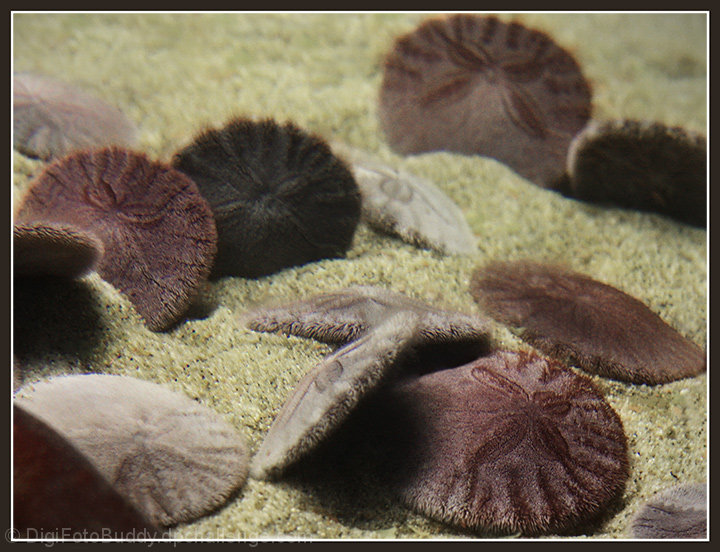
composition: The lower right sand dollar is a little too close to the edge of the frame, moving a little could have helped that. But, the rest of the dollars are positioned really well in frame.

color: nice, neutral and soft colors, reminds me of the beach.

contrast:
very nice contrast, just enough to make them stand out against the sand.

focus:
I don't know if the bit of blur was intentional or not. If it was, I quite like the effect it gives, like being underwater. But some people loathe blur like this, so maybe that's were a few of the lower votes came from.

depth of field:
great use of depth of field, with only one sand dollar in focus, i see its beautiful details.

lighting:
very nice, i love lighting underwater, its so magical.You captured it well.

other: i like this image, but there is just something 'off' about it. i don't know if its just the effect of the glass between the water and the lens, but it looks so surreal. also, the obstruction in the lower left side of the image is distracting. I hope to see more work from you, and you have improved over the course of your stay here at DPC, so don't give up! If you have any more questions, feel free to PM me whenever you like.
-Kari Ann
  Photographer found comment helpful.
01/11/2009 07:48:02 PM
Incredibly tactile. Lovely idea and shot.
  Photographer found comment helpful.
 Comments Made During the Challenge
01/11/2009 02:36:06 AM
I like the soft almost pastel colors and the light gaussian blur. Well done.
  Photographer found comment helpful.
01/07/2009 03:06:28 PM
Nice use of the DOF.
  Photographer found comment helpful.
01/06/2009 02:32:11 PM
aww sooo KAWAII
  Photographer found comment helpful.


Home - Challenges - Community - League - Photos - Cameras - Lenses - Learn - Help - Terms of Use - Privacy - Top ^
DPChallenge, and website content and design, Copyright © 2001-2025 Challenging Technologies, LLC.
All digital photo copyrights belong to the photographers and may not be used without permission.
Current Server Time: 04/12/2025 03:08:53 AM EDT.