This is Kari Ann, greetings from the Critique Club:
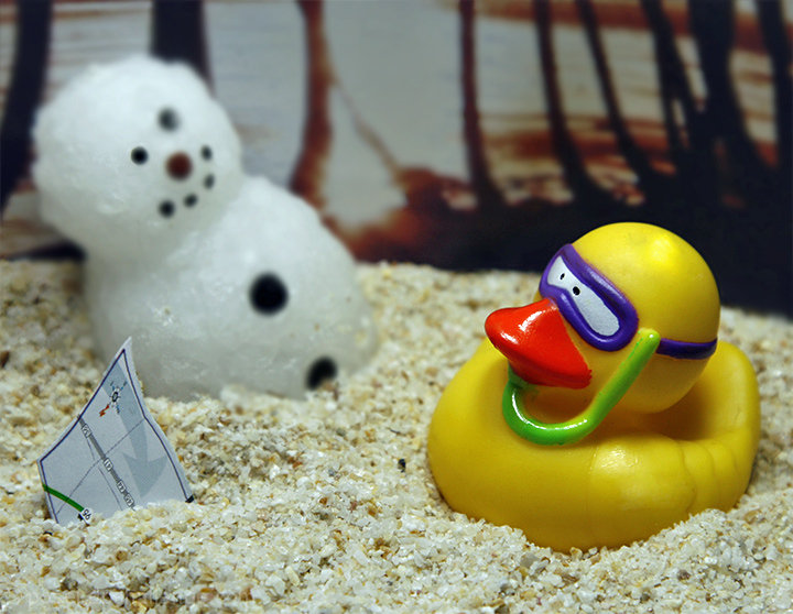
composition: maybe having both of the characters in complete focus would have helped the image. i feel the eye of the snowman that isn't in focus, distracts.
color: nice, but the orange in the background does not compliment the sand very well. maybe a blue or black background would have helped.
contrast: good, not much else to say in this category.
focus: as said before, both characters would have been nicer in focus.
depth of field: someone suggested earlier to have the background all out of focus would have been better. I agree.
lighting: pretty flat, does not compliment the scene very well.
other: the image, overall, made me smile, i love how different you took this challenge. But, the flaws are obviously in the execution and location. First, lose the background. Second, bring both characters into the focal plane. Third, make sure that the cute little map is still in the frame, love it. Fourth, try different lighting. With a little fine tuning, this could be a very well accomplished image. I hope this helped you out. If you have any more questions, feel free to PM me. Keep on chugging along!
-Kari Ann
Message edited by author 2009-01-17 21:45:51. |