| Author | Thread |
Comments Made During the Challenge  |
|
|
05/16/2004 06:46:52 PM |
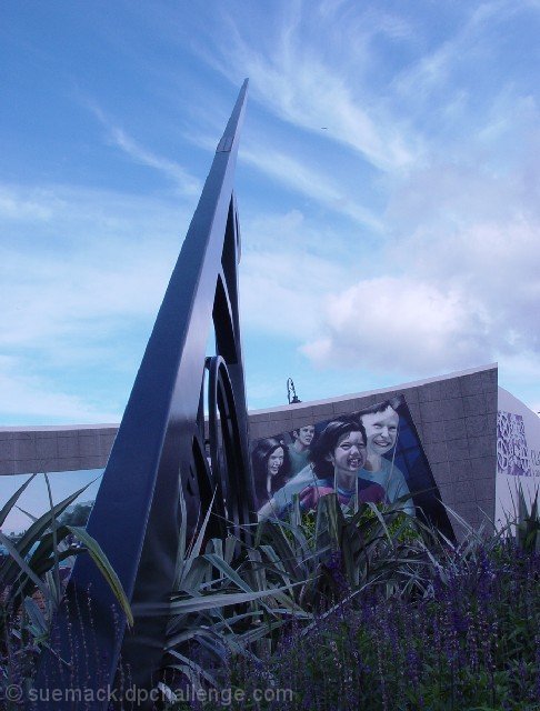
| Beautiful perspective, nice composition. Nit: Seems to have a slightly blue/magenta cast (nikon?) and there's a line in the sky, which may be a plane, or may be some other noise. It think it might have been better cloned out. |
|
 Photographer found comment helpful. Photographer found comment helpful. |
|
|
05/16/2004 05:19:04 PM |
Composition: Subject Placement, Cropping, Background 5
Technical: Focus, Exposure, Lighting, Processing 4
Appeal: Is it Interesting, Motivating, Etc. 5
How well does it meet the challenge: 8
Total Averaged Rating(Rounded) 6
Your subject is under exposed. Try shooting at a different time of day maybe. |
|
| Photographer found comment helpful. |
|
|
05/16/2004 05:03:40 PM |
| I really do not know what to see about the colors in this....I like the architecture and the mural, but the colors are too cast in blue. It's a hard image to take and I fail frequently....in post if you had tried to play with levels you might have been able to do something....not sure. |
|
| Photographer found comment helpful. |
|
|
05/16/2004 04:00:24 PM |
Composition: (Subject Placement, Cropping, Background): 7
Technical: (Focus, Exposure, Lighting, Processing): 5
Appeal: (Is it Interesting, Motivating, etc.): 6
Challenge: (How well it meets the challenge): 6
Average (rounded): 6
|
|
| Photographer found comment helpful. |
|
|
05/14/2004 08:17:36 AM |
| Nice composition but it looks like you slid the blue too high to get the sky right and the rest of the objects suffer for it. You have a picture of a nice sky with murky other stuff. |
|
| Photographer found comment helpful. |
|
|
05/12/2004 09:39:00 AM |
| The foreground in this is dark and lacks much in the way of detail or color. I assume this is part of a really big sundial. |
|
| Photographer found comment helpful. |
|
|
05/12/2004 07:33:04 AM |
| This is an interesting viewpoint for a very interesting-looking building. It seems that the sky is perfectly exposed to the detriment of the forebround, losing most of the color in the plants and the details of the building. I think a little brightening in levels or curves coujld have improved this. |
|
| Photographer found comment helpful. |
|
|
05/10/2004 11:54:34 PM |
| I like the colors in this shot. |
|
| Photographer found comment helpful. |
|
|
05/10/2004 02:33:48 PM |
| Thats one big sundial! Interesting subject with good leading lines. |
|
| Photographer found comment helpful. |
|
|
05/10/2004 09:35:18 AM |
| The purple/magenta cast is distracting. I believe this could be far bettershould that be corrected. |
|
| Photographer found comment helpful. |
|
|
05/09/2004 08:44:51 PM |
|
| Photographer found comment helpful. |
Home -
Challenges -
Community -
League -
Photos -
Cameras -
Lenses -
Learn -
Help -
Terms of Use -
Privacy -
Top ^
DPChallenge, and website content and design, Copyright © 2001-2025 Challenging Technologies, LLC.
All digital photo copyrights belong to the photographers and may not be used without permission.
Current Server Time: 04/07/2025 12:53:33 PM EDT.