| Author | Thread |
Comments Made During the Challenge  |
|
|
05/18/2004 12:48:48 PM |
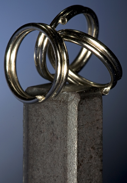
| I enjoy the concept, and I think this shot makes a good statement. But at the same time, it lacks.... something. I really couldn't say what, but it just doesn't jump out at me. Maybe a different background color to offset the cold tone of the metal? Maybe a more simplistic metal (say, one ring instead of three?) to streamline the angles a bit more? I'm really not sure. |
|
 Photographer found comment helpful. Photographer found comment helpful. |
|
|
05/18/2004 09:45:07 AM |
| stunning photo, well composed and lit. leaps off the screen!! i hope this does well. |
|
|
|
05/18/2004 01:50:46 AM |
| Lighting on this is very nice. Personally, I would have cropped more off the bottom, it seems a bit top-heavy now. |
|
| Photographer found comment helpful. |
|
|
05/16/2004 09:19:30 AM |
| Um, I hate to be the one to break this to you, but steel is not the opposite of a magnet. It's an interesting composition, well exposed and focused, but without the challenge context, it seems nonsensical. |
|
|
|
05/14/2004 01:10:35 PM |
| geart idea. maybe the lighting should have been worked on. the reflexions on the ring are a little too bright |
|
| Photographer found comment helpful. |
|
|
05/14/2004 12:46:09 PM |
| Cool composition, but the overexposed spots are a bit distracting. |
|
|
|
05/14/2004 12:17:09 PM |
| This is a good picture technically. I like the lighting and the DOF. I don't understand what is opposite about the elements in it, though. To me the picture needs something to add some life or soul to it. It feels very cold and clinical. Perhaps that was the intended effect. |
|
|
|
05/14/2004 12:05:28 PM |
|
|
|
05/13/2004 02:27:26 PM |
| Beautiful. I like the opposite of straights and curves in this aswell. Love the way the light reflects off those - what are they? |
|
|
|
05/13/2004 07:01:21 AM |
| It took me a couple of seconds.....but an original idea. |
|
|
|
05/12/2004 08:06:45 PM |
| I'm suprised that no one else used a magnet for this challenge. (not of the ones I've seen so far any way). Interesting composition and I like the monochromatic quality. 7. |
|
|
|
05/12/2004 03:13:57 AM |
| Great concept, thought about this one myself but didn't have a magnet! |
|
|
|
05/11/2004 11:49:57 PM |
| pretty good. would be better if the light was more diffuse. this picture is hurt by the harsh reflections |
|
| Photographer found comment helpful. |
Home -
Challenges -
Community -
League -
Photos -
Cameras -
Lenses -
Learn -
Help -
Terms of Use -
Privacy -
Top ^
DPChallenge, and website content and design, Copyright © 2001-2025 Challenging Technologies, LLC.
All digital photo copyrights belong to the photographers and may not be used without permission.
Current Server Time: 04/07/2025 12:50:32 PM EDT.