| Author | Thread |
Comments Made During the Challenge  |
|
|
12/30/2008 06:09:41 AM |
| Good idea. I think a little negative space would do this one some good. Its just too tight of a crop for my tastes. |
|
 Photographer found comment helpful. Photographer found comment helpful. |
|
|
12/28/2008 10:07:59 AM |
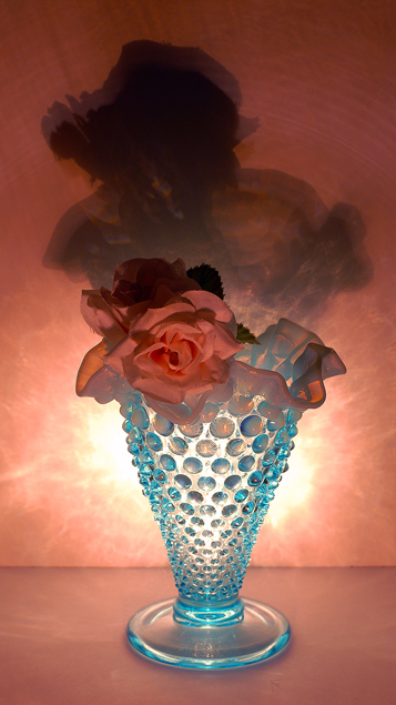
| I love the pattern on the wall from the vase. Ideally I think I'd like the rose slightly brighter but then you'd blow out your whites more, which I understand may not work in basic editing. Cool concept. |
|
| Photographer found comment helpful. |
|
|
12/26/2008 01:27:48 PM |
| Nice colours and interesting subject, though the roses don't stand out particularly against the similar coloured background. |
|
| Photographer found comment helpful. |
|
|
12/26/2008 07:39:03 AM |
| I LOVE this! Excellent colors, love the stars in the nubs, the shadow is so very prominent. Great work. To be nitpicky, the lighting is just a bit overblown on either side. But really, the only thing keeping me for giving it a 10 is the proportion. The elongated shadow above the vase gives it an odd vertical dimension to my (newbie) eyes which is unpleasant. |
|
| Photographer found comment helpful. |
|
|
12/24/2008 06:52:05 AM |
| a pity the ornate blue vase had not been exploited to bring out what could have been pretty interesting shadows... |
|
| Photographer found comment helpful. |
Home -
Challenges -
Community -
League -
Photos -
Cameras -
Lenses -
Learn -
Help -
Terms of Use -
Privacy -
Top ^
DPChallenge, and website content and design, Copyright © 2001-2025 Challenging Technologies, LLC.
All digital photo copyrights belong to the photographers and may not be used without permission.
Current Server Time: 04/08/2025 05:05:26 AM EDT.