| Author | Thread |
Comments Made During the Challenge  |
|
|
12/28/2008 04:37:57 PM |
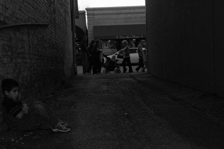
| I like the idea, especially that the child is so off-center as to imply unimportance. The horizon is tilted though, and shot may be a bit too dark overall imo. Well conceived shot. |
|
|
|
12/28/2008 08:00:33 AM |
| I'm tempted to complain about the lack of contrast, but I wonder if it would have the same powerful effect. Nice job. |
|
|
|
12/28/2008 05:32:11 AM |
| Very nice picture. Increasing the contrast a bit would have done wonders IMHO. |
|
|
|
12/27/2008 10:04:30 AM |
| Great idea but lighting is everything and the entire image just looks dark and flat, its just my opinion but I think getting a small amount of spot type lighting on your subject would have made this idea work. |
|
|
|
12/27/2008 08:39:15 AM |
|
|
|
12/27/2008 05:28:38 AM |
| good set up...just a little dark for me...a little more work on the levels and curves? |
|
|
|
12/26/2008 10:23:51 PM |
| I like the idea for this shot but I feel it would have had far more impact if the top was cropped lower so the light area was not included. |
|
|
|
12/26/2008 07:02:13 PM |
| I love this picture, it really tells a story, and it's beautifully composed. Top marks! |
|
|
|
12/25/2008 02:46:19 PM |
| Great story, but the technicals have let you down. Needs a clockwise rotate and a little dodge & burn. |
|
|
|
12/25/2008 02:46:51 AM |
|
|
|
12/24/2008 08:53:59 AM |
| A little on the dark side... otherwise a very poignant image. |
|
|
|
12/24/2008 04:04:56 AM |
A concept with potential, unfortunately spoiled by some flaws: image way too dark, background not particularly interesting and image leaning.
Not a very high rating, sorry.
Happy Christmas ! |
|
|
|
12/23/2008 08:23:06 PM |
|
|
|
12/23/2008 02:58:41 PM |
| Too dark. Needs more shadow detail and way more tonal range. |
|
|
|
12/23/2008 10:11:48 AM |
| Waaaaaaaaaaaay too dark all around. On my monitor I almost completely missed the child in the left foreground. |
|
|
|
12/23/2008 09:56:36 AM |
| aww lonely kid, great idea for a shot, the tilted horizon is not working for me though, either keep it straight and level or go extreeme and really tilt it. Also the exposure is right for the buildings in the background not the ally or the kid, be careful what you want to center of attention to be |
|
|
|
12/23/2008 09:39:28 AM |
| Touchingly sad. The dark exposure sets the mood, the tilted horizon suggests that all is not right in the world, while the passers-by go about their business. Definitely a 10. |
|
|
|
12/22/2008 12:14:19 PM |
| First of all, I'm finding the tilted horizon distraction. Also, this looks a tad underexposed... perhaps you intended that though, because it does give the image a very gloomy mood. I do wonder though, how this might look if at least something were bright. Perhaps the people passing by should be bright, and the boy in the dark, underexposed shadows, to emphasize the concept that he is alone while everyone else is enjoying the hustle and bustle of the holidays. That could probably be achieved with burning and dodging in photoshop. Just some thoughts - sorry for rambling. :) The composition is great here, and the black and white perfect. Overall this is a very nicely done photograph. |
|
|
|
12/21/2008 11:24:51 PM |
| a bit too dark, I would more light and contrast here and possibly some Christmas lights on the background. |
|
|
|
12/21/2008 08:41:27 PM |
| Good idea and pose. Composition is weak, as is the lighting. |
|
|
|
12/21/2008 08:01:10 PM |
| I understand that this was probably intended to be dark, but to me it's a bit too dark with not quite enough contrast to work for m. |
|
Home -
Challenges -
Community -
League -
Photos -
Cameras -
Lenses -
Learn -
Help -
Terms of Use -
Privacy -
Top ^
DPChallenge, and website content and design, Copyright © 2001-2025 Challenging Technologies, LLC.
All digital photo copyrights belong to the photographers and may not be used without permission.
Current Server Time: 04/07/2025 01:25:07 AM EDT.