| Author | Thread |
Comments Made During the Challenge  |
|
|
04/14/2002 08:45:00 PM |
| no impact or interest - for me |
|
|
|
04/13/2002 01:49:00 PM |
| Very nice image and use of a sharp value scale to turn this into a dramatic image. |
|
|
|
04/13/2002 01:51:00 AM |
| I'm not too excited with the way you cropped it. |
|
|
|
04/12/2002 11:48:00 PM |
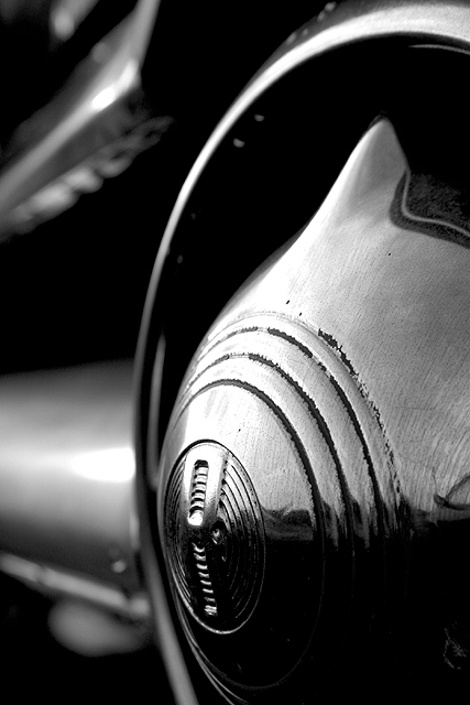
Lighting seems to let this done - it seems somewhat 'flat' across the wheel (?)
It is a picture of curves, just doesn't inspire me - technically good with some Depth of Field blurring and sharp at the main interest point. |
|
|
|
04/11/2002 12:57:00 AM |
| Nice curves, and I love where you put the focus. |
|
|
|
04/10/2002 02:00:00 PM |
|
|
|
04/10/2002 01:50:00 PM |
| nice detail - B & W works well here. |
|
|
|
04/10/2002 12:25:00 PM |
| The narrow depth of field works very nicely. If I were to change this I'd frame it about 10% down and to the right. |
|
|
|
04/10/2002 10:07:00 AM |
| Great texture on the fg chrome, and great high contrast tone. Even better with less depth of field to get a creamier bg, but that can be tough to do with a digital. Bravo. |
|
|
|
04/09/2002 10:57:00 PM |
| mmm. looks delicious. i love the glossy, sleek contrast. |
|
|
|
04/09/2002 07:27:00 PM |
| Doesn't catch my attention, sorry. |
|
|
|
04/09/2002 10:17:00 AM |
| Nice black and white choice! |
|
|
|
04/09/2002 09:59:00 AM |
| I am trying to figure out what part of the ford it is. Great picture..I love it. Good lighting and angle. :) |
|
|
|
04/09/2002 09:39:00 AM |
| Excellent composition, beautiful tonal range, nice detail. Very nice! |
|
|
|
04/09/2002 07:35:00 AM |
| nice! but i'd like to see the curve of the steering wheel filling up more of the photo... |
|
|
|
04/08/2002 09:36:00 PM |
|
|
|
04/08/2002 08:46:00 PM |
| I'm usually not fond of b&w, but this is really nice. |
|
|
|
04/08/2002 08:02:00 PM |
| this is an amazing image. the texture, lighting and contrast, all perfect to me. |
|
|
|
04/08/2002 03:14:00 PM |
| Being from the Motor City, I'm always a sucker for autos. nice choice of a brushed hubcap to reduce reflection (if that was intentional!). |
|
|
|
04/08/2002 02:43:00 PM |
| I like the way the reflection is matted by the sheen on the hubcab, but I feel it needs a little more light one the centre of it. |
|
|
|
04/08/2002 02:30:00 PM |
| this is very nice. i love the subject, here. the contrast is really nice and the angle and position of the subject is good, too. i think the only thing that bothers me a little is that it might be just a tad underexposed. the blacks are just too black and lose some of the detal of the wheel. good job, overall. |
|
|
|
04/08/2002 02:01:00 PM |
| I like the antique overtones and the excellent contrast in this photo... You are in my top 20... Score: 7 |
|
|
|
04/08/2002 12:28:00 PM |
| The B&W works well gives it quite a cold feel. |
|
|
|
04/08/2002 01:02:00 AM |
|
Home -
Challenges -
Community -
League -
Photos -
Cameras -
Lenses -
Learn -
Help -
Terms of Use -
Privacy -
Top ^
DPChallenge, and website content and design, Copyright © 2001-2026 Challenging Technologies, LLC.
All digital photo copyrights belong to the photographers and may not be used without permission.
Current Server Time: 02/01/2026 08:26:43 AM EST.