DPChallenge: A Digital Photography Contest You are not logged in. (log in or register
 
Challenge Entries
Portfolio Images
This image is not part of a public portfolio.
Vertical Rustics.
Vertical Rustics.
pumpkin42


Photograph Information Photographer's Comments
Challenge: Straight (Basic Editing)
Camera: Canon EOS-400D Rebel XTi
Location: Hilo, Hawaii.
Date: Nov 27, 2008
Aperture: 100
ISO: 5.6
Shutter: 1/60
Galleries: Cityscape, Urban
Date Uploaded: Nov 27, 2008

A building next to my college. Taken with an 18-55mm image stabilizer lens. Usage of curves, levels and color balance in Photoshop CS2.

Statistics
Place: 132 out of 133
Avg (all users): 3.3269
Avg (commenters): 3.1111
Avg (participants): 3.3750
Avg (non-participants): 3.3103
Views since voting: 720
Views during voting: 217
Votes: 156
Comments: 10
Favorites: 0


Please log in or register to add your comments!

AuthorThread
12/11/2008 02:55:18 PM
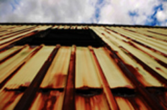
There are a couple of things to really like about this shot. First, the wonderful parallel lines of the building's drab, rusted siding leading your eye to the beautiful clouds with snatches of blue sky. You've used an unusual angle for this shot, and it really adds interest. The window also provides some visual relief from the vertical lines, without interfering with the effect.
The colors in the siding are not very attractive to most people (tans to browns). Also, the edge of the top of the building is not parallel with the top edge of the photo. It looks like you leveled the shot using the break in the siding, but that horizontal line blends into the surroundings, compared to the break between the building and the sky, which is a sharp contrast, and really the focus of the picture.
On the emotional side, this shot does a great job of presenting the viewer with a contrast between the decay of the man-made and constant beauty and newness of the natural. At the same time is does not strongly take one side or the other, but leaves it to the viewer's preference and experience.

 Comments Made During the Challenge
12/09/2008 03:48:21 PM
Too soft in focus. Great idea but needs to be sharpened.
12/08/2008 06:23:59 PM
This is out of focus, very small, and seemingly overprocessed. there is potential here with the composition, but more work on the exicution is needed
12/07/2008 11:18:16 PM
It would be much easier to give you a high score if you'd use the maximum display size for your entries. I'm sure I'm not the first to point this out.
12/04/2008 03:35:33 PM
Use all your pixels, it is hard to judge being so small, but it looks out of focus.
12/04/2008 07:45:11 AM
I think you should have planned your photo better. I can't see any focus, the colors are really weird and i think your idea was messed up because of the size of this picture. Always use the biggest size that DP permits. Sorry if i was rude, just trying to help.
12/03/2008 02:36:43 PM
Wish this were bigger so I could get a better look at it. It looks to be a pretty nice photo.
12/03/2008 01:34:11 PM
I know you've aleady heard it, but too bad this is so small, it can't truly be appreciated.
12/03/2008 10:01:11 AM
Very small. People don't like the small ones - this will probably be bad for your score. And even at this small size it looks out of focus.
12/03/2008 03:05:27 AM
too small to see,


Home - Challenges - Community - League - Photos - Cameras - Lenses - Learn - Help - Terms of Use - Privacy - Top ^
DPChallenge, and website content and design, Copyright © 2001-2025 Challenging Technologies, LLC.
All digital photo copyrights belong to the photographers and may not be used without permission.
Current Server Time: 04/07/2025 01:29:05 PM EDT.