| Author | Thread |
Comments Made During the Challenge  |
|
|
05/11/2004 07:02:29 AM |
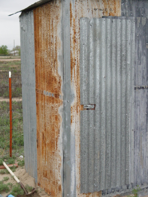
| The tools on the ground, and the red post on the left of the image are distracting from the subject. Onfortunately, the subject itself doesn't have neough contrast throughout it for how much of the image it dominates. Might have worked better to show more of its edges, or take the shot in a different lighting configuration (maybe with a lower sun). |
|
|
|
05/11/2004 05:36:39 AM |
Composition: Subject Placement, Cropping, Background 6
Technical: Focus, Exposure, Lighting, Processing 6
Appeal: Is it Interesting, Motivating, Etc.? 3
How well does it meet the challenge: 10
Total Averaged Rating 6.25 Dick
|
|
|
|
05/10/2004 04:14:25 PM |
This is a good photo of the unaesthetic appearance of rural sprawl.
It is just not my cup of tea.
A 2. |
|
|
|
05/09/2004 01:41:04 PM |
| in my opinion this photo looks like a rush entry just to meet the challenge. it looks like very little thought went into the photo. |
|
|
|
05/08/2004 03:31:44 PM |
| Nice implementaiton of the challenge. IMO - it would have been better if the orange fence post were not competing for my attention along the left edge. |
|
|
|
05/07/2004 07:02:12 PM |
Composition: Subject Placement, Cropping, Background 5
Technical: Focus, Exposure, Lighting, Processing 5
Appeal: Is it Interesting, Motivating, Etc. 4
How well does it meet the challenge: 7
Total Averaged Rating(Rounded) 5
|
|
|
|
05/07/2004 09:04:44 AM |
| focus is off. whole thing seems kind of drab. the little red pole is quite distracting. |
|
|
|
05/07/2004 04:57:21 AM |
| This image could have used a little stronger contrast, but overall composition is good. 7 |
|
|
|
05/06/2004 05:03:08 PM |
|
Home -
Challenges -
Community -
League -
Photos -
Cameras -
Lenses -
Learn -
Help -
Terms of Use -
Privacy -
Top ^
DPChallenge, and website content and design, Copyright © 2001-2025 Challenging Technologies, LLC.
All digital photo copyrights belong to the photographers and may not be used without permission.
Current Server Time: 04/12/2025 08:54:46 AM EDT.