| Author | Thread |
Comments Made During the Challenge  |
|
|
05/11/2004 12:48:27 PM |
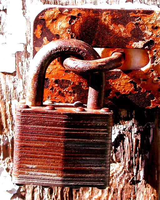
| It looks a bit washed out, but perhaps that was what you were aiming for as it seems to ahve some good contrasts between all the rusted pieces. |
|
 Photographer found comment helpful. Photographer found comment helpful. |
|
|
05/11/2004 09:26:37 AM |
|
| Photographer found comment helpful. |
|
|
05/11/2004 05:51:49 AM |
|
| Photographer found comment helpful. |
|
|
05/10/2004 12:25:25 PM |
| The highlights on the left of the image look overexposed and pull attention away from the subject. I also get an impression of oversaturation on the colors, but that may be due to the brightness/contrast settings. |
|
| Photographer found comment helpful. |
|
|
05/09/2004 08:19:12 AM |
|
| Photographer found comment helpful. |
|
|
05/09/2004 07:22:29 AM |
| the lighting is a bit too strong |
|
| Photographer found comment helpful. |
|
|
05/09/2004 05:37:03 AM |
Composition: Subject Placement, Cropping, Background 6
Technical: Focus, Exposure, Lighting, Processing 4
Appeal: Is it Interesting, Motivating, Etc.? 5
How well does it meet the challenge: 7
Total Averaged Rating 5.50 Dick
Quite a bit overexposed, and needs additional subject matter in composition. |
|
| Photographer found comment helpful. |
|
|
05/08/2004 08:02:07 PM |
| The contrast might be a bit much. This effect may have been what you were after, but the blown-out upper left corner really detracts from the overall image. Otherwise, the texture and composition are quite nice. |
|
| Photographer found comment helpful. |
|
|
05/08/2004 05:32:03 PM |
Composition: Subject Placement, Cropping, Background 6
Technical: Focus, Exposure, Lighting, Processing 6
Appeal: Is it Interesting, Motivating, Etc. 5
How well does it meet the challenge: 7
Total Averaged Rating(Rounded) 6
|
|
| Photographer found comment helpful. |
|
|
05/08/2004 03:41:03 PM |
Besides being overexposed, the colors are over saturated. The compositon and subject matter look like this had the elements of a very interesting picture.
A 3. |
|
| Photographer found comment helpful. |
|
|
05/07/2004 10:52:26 AM |
| the highlights are too blown out for my tastes, but otherwise pretty good. |
|
| Photographer found comment helpful. |
|
|
05/07/2004 05:42:39 AM |
| nice i like this, makes you have a think |
|
| Photographer found comment helpful. |
|
|
05/07/2004 03:20:53 AM |
| Too red to believe it. But I give you a 9 anyway. |
|
| Photographer found comment helpful. |
|
|
05/06/2004 08:07:21 PM |
| a little too bright on shank. |
|
| Photographer found comment helpful. |
|
|
05/06/2004 11:25:46 AM |
| The red seems a little too saturated. |
|
| Photographer found comment helpful. |
|
|
05/06/2004 10:35:13 AM |
| Way to red and the white spots are a bit overexposed. Great subject though. |
|
| Photographer found comment helpful. |
|
|
05/06/2004 08:51:52 AM |
| Nice lock there but the picture is very overexposured |
|
| Photographer found comment helpful. |
|
|
05/06/2004 04:46:08 AM |
| Would have been better with less contrasty light |
|
| Photographer found comment helpful. |
|
|
05/06/2004 02:30:05 AM |
| I would've liked it better with a tad less contrast (I think) the hot spots are pretty dominant, I like the topic and texture - 7 |
|
| Photographer found comment helpful. |
|
|
05/05/2004 06:22:10 PM |
| Love the vibrant and contrasty color. It really complements the rust. |
|
| Photographer found comment helpful. |
|
|
05/05/2004 03:03:32 PM |
| This is an attractive study but it appears over-saturated and over-sharpened. Also, the burnt out highlights on the left are distracting. |
|
| Photographer found comment helpful. |
|
|
05/05/2004 10:26:50 AM |
| Way too high key for me. The strong contrast emphasizes the hot spots in the left corners and on the lock. |
|
| Photographer found comment helpful. |
|
|
05/04/2004 09:52:00 PM |
| overexposed (on purpose?), but that's why I like it so much.. makes the rusty colors really stand out... 9 |
|
| Photographer found comment helpful. |
|
|
05/04/2004 09:14:04 PM |
| The bright reflections are somewhat too harsh... |
|
| Photographer found comment helpful. |
Home -
Challenges -
Community -
League -
Photos -
Cameras -
Lenses -
Learn -
Help -
Terms of Use -
Privacy -
Top ^
DPChallenge, and website content and design, Copyright © 2001-2025 Challenging Technologies, LLC.
All digital photo copyrights belong to the photographers and may not be used without permission.
Current Server Time: 04/07/2025 05:57:27 AM EDT.