| Author | Thread |
|
|
11/22/2008 09:11:08 AM |
Greetings from the Critique Club Terrence!
First Impression: Decent photo, but doesn't strike me as anything special.
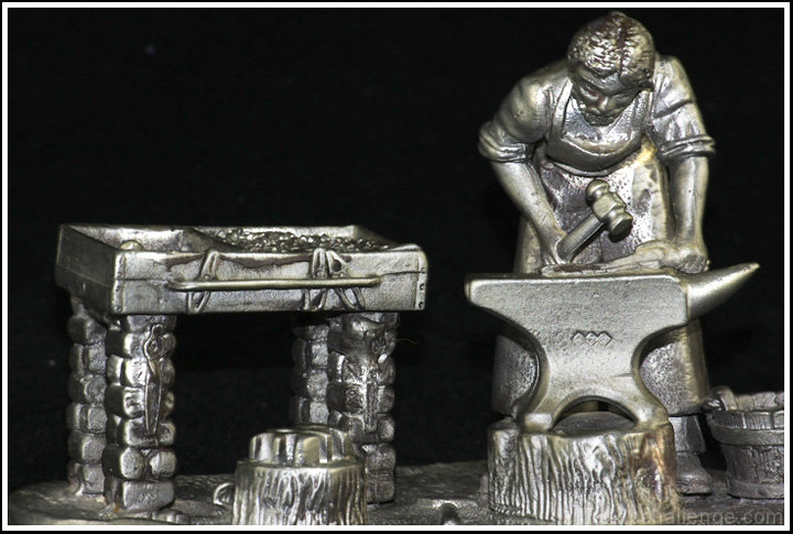
Composition: Decent composition. The crop is too tight for me. I would have liked to have seen a little more black around the edge of the subject. It feels very tight near the top of his head and the right side of the anvil. The lighting is also a tad harsh from the flash. If you would have a constant light source from the left side of the object, it would have caste shadows and would have given the photo a different feel. The subject is also too close to the backdrop because I can see its texture on the lower part of the photo. There is also four white spots on the backdrop that are distracting.
Subject: The subject is very interesting, but I don't know if the material it is made of represents the periodic table of elements. The blacksmith himself on the other hand does represent the periodic table. When I think of a blacksmith, I think of working with iron. I like how the subject has a lot of texture its self. Like Trollman said, it would have been better if it was a real blacksmith, but since they are hard to find, I can't fault you for that.
Creativity: This photo does not show a whole lot of creativity because it is a photo of an object that is already artistic.
Improvements: Loosen the crop, experiment with different lighting and move the subject away from the back drop. You could use a polarizing filter to reduce some of the reflections.
My Thoughts: If you try using the improvements I have listed, the photo would be more appealing to me. It would also be a very good B&W photo. You said in your comments that you made this piece. If so, I am very impressed with your metalworking skills.
Overall, I scored this photo a 6, which is above average in my book. If you have any questions please PM me. I hope my critique has been help and informative in some way.
Cheers,
Ron |
|
 Photographer found comment helpful. Photographer found comment helpful. |
Comments Made During the Challenge  |
|
|
11/15/2008 03:09:28 PM |
| Interesting sculpture. The lighting certainly brings out texture. |
|
| Photographer found comment helpful. |
|
|
11/14/2008 03:57:52 PM |
| nice job on the lighting! |
|
| Photographer found comment helpful. |
|
|
11/14/2008 03:09:42 PM |
| Nice idea, but I'm not keen on the composition, maybe pull back a bit, use less harsh lighting. |
|
| Photographer found comment helpful. |
|
|
11/13/2008 10:47:29 AM |
|
| Photographer found comment helpful. |
|
|
11/12/2008 10:44:14 AM |
Looks good. But other than an appropriate crop and a black background I can't really see that it is very creative. It's a picture of an object.
If this had been a picture of a real black smith hammering away on iron it would obviously have scored much better.
I realize of course that most of us don't have black smiths in our neighborhood but I hope you also realize that this image then has to score less. |
|
| Photographer found comment helpful. |
|
|
11/11/2008 11:45:37 AM |
| I really like this scene and the fact that it's an interesting scene to capture the element that is part of this challenge. |
|
| Photographer found comment helpful. |
|
|
11/11/2008 06:34:41 AM |
| In general images of other art does not appeal to me. |
|
| Photographer found comment helpful. |
|
|
11/10/2008 10:47:10 PM |
| the challenge was for elements not alloys |
|
| Photographer found comment helpful. |
Home -
Challenges -
Community -
League -
Photos -
Cameras -
Lenses -
Learn -
Help -
Terms of Use -
Privacy -
Top ^
DPChallenge, and website content and design, Copyright © 2001-2025 Challenging Technologies, LLC.
All digital photo copyrights belong to the photographers and may not be used without permission.
Current Server Time: 04/08/2025 04:48:13 AM EDT.