| Author | Thread |
|
|
05/16/2004 10:40:17 PM |
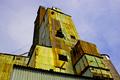
Thanks to everyone for your votes and comments. I tried to make this shot per the challenge, adding something around rust, but I guess it didn't work as well as I'd hoped. Oh well, I'll just have to try harder next time. Thanks again to everyone.
|
|
Comments Made During the Challenge  |
|
|
05/11/2004 12:43:15 PM |
too set up.
try taking shots in their natural state |
|
|
|
05/11/2004 11:16:55 AM |
Composition: Subject Placement, Cropping, Background 8
Technical: Focus, Exposure, Lighting, Processing 7
Appeal: Is it Interesting, Motivating, Etc.? 6
How well does it meet the challenge: 10
Total Averaged Rating 7.75 Dick
|
|
 Photographer found comment helpful. Photographer found comment helpful. |
|
|
05/09/2004 07:47:28 PM |
Composition: Subject Placement, Cropping, Background 6
Technical: Focus, Exposure, Lighting, Processing 6
Appeal: Is it Interesting, Motivating, Etc. 6
How well does it meet the challenge: 7
Total Averaged Rating(Rounded) 6
|
|
| Photographer found comment helpful. |
|
|
05/09/2004 02:41:10 PM |
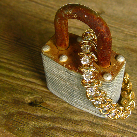
Amazed that lock worked enough to insert bracelet. The background however does not work for me.
A 4. |
|
| Photographer found comment helpful. |
|
|
05/08/2004 07:45:17 PM |
| Which is padlocked t which? It's a moot point. Good contrast. |
|
| Photographer found comment helpful. |
|
|
05/08/2004 11:01:16 AM |
| Interesting idea but not sure if it works. |
|
| Photographer found comment helpful. |
|
|
05/08/2004 10:21:48 AM |
| With that jewel You do need a 10 :) |
|
| Photographer found comment helpful. |
|
|
05/07/2004 08:45:37 PM |
|
| Photographer found comment helpful. |
|
|
05/07/2004 06:38:17 PM |
| This seems to fit this weeks challenge as well. Good picture but seems cropped to far right. |
|
| Photographer found comment helpful. |
|
|
05/06/2004 07:46:28 PM |
| Lovely picture. The colors and focus are very appealing. |
|
| Photographer found comment helpful. |
|
|
05/06/2004 11:09:06 AM |
| Good idea, but the background distracts a bit (too much grain coupled with the lines on the lock I think.) |
|
| Photographer found comment helpful. |
|
|
05/05/2004 11:09:02 AM |
| Like your idea very much. Creative. I don't like the wooden table. I think it takes away from the shot. Also the composition and light could of been improved to give this a bit more punch. From above is awkward to view this particular shot. |
|
| Photographer found comment helpful. |
|
|
05/05/2004 07:47:29 AM |
| Did you try it without the bracelet? I think it could be better without it, it doesnt do anything for me, But I like the picture, good perspective, Good luck |
|
| Photographer found comment helpful. |
|
|
05/05/2004 06:02:22 AM |
Nice contrast of subjects, but I wish there was more contrast in color. It is there, just not as sharp as I would have preferred. I would have also preferred the DOF to be a bit larger to include all of the subject or a lot shorter to include only a small portion (but this is a matter of personal taste).
David |
|
| Photographer found comment helpful. |
|
|
05/05/2004 02:08:00 AM |
|
| Photographer found comment helpful. |
|
|
05/05/2004 12:28:06 AM |
| Yes, I can see this as an ad, good job. |
|
| Photographer found comment helpful. |
Home -
Challenges -
Community -
League -
Photos -
Cameras -
Lenses -
Learn -
Help -
Terms of Use -
Privacy -
Top ^
DPChallenge, and website content and design, Copyright © 2001-2026 Challenging Technologies, LLC.
All digital photo copyrights belong to the photographers and may not be used without permission.
Current Server Time: 02/01/2026 09:07:33 AM EST.