| Author | Thread |
Comments Made During the Challenge  |
|
|
05/04/2004 03:12:47 PM |
| not very original and very recognisable. |
|
|
|
05/04/2004 02:42:04 PM |
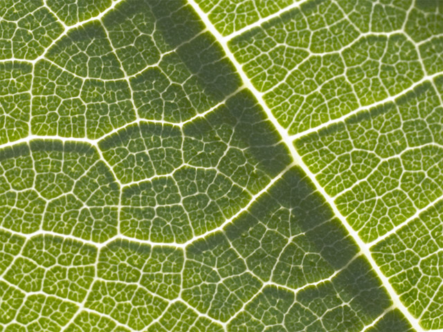
| A very good picture, but a bit too obvious what it is. Actually it looks a bit like a town plan, with streets and squares. No traffic jams. |
|
|
|
05/03/2004 11:27:56 PM |
| Could use a contrast and levels boost. Not sure if this fits the challenge? |
|
|
|
05/03/2004 09:14:37 PM |
| Good idea, but I don't like the lack of dark shadows, it looks too hazy |
|
|
|
05/03/2004 06:59:00 PM |
| This looks a little fuzzy to me, A bit mroe contrast might have made it pop. |
|
|
|
05/03/2004 06:47:04 PM |
| Macro.... not abstract... bit over exposed also. |
|
|
|
05/03/2004 12:50:39 PM |
| Good idea but needs a touch more contrast to make the veins stand out more. |
|
|
|
05/03/2004 04:53:03 AM |
|
|
|
05/03/2004 12:33:21 AM |
| could use some contrast enhancement |
|
|
|
05/03/2004 12:21:27 AM |
| A bit over exposed. Nice macro though. Abstract? Not sure. |
|
Home -
Challenges -
Community -
League -
Photos -
Cameras -
Lenses -
Learn -
Help -
Terms of Use -
Privacy -
Top ^
DPChallenge, and website content and design, Copyright © 2001-2026 Challenging Technologies, LLC.
All digital photo copyrights belong to the photographers and may not be used without permission.
Current Server Time: 02/01/2026 12:23:28 PM EST.