| Author | Thread |
Comments Made During the Challenge  |
|
|
11/04/2008 01:09:58 PM |
Great idea.
Great execution as well.
8 |
|
 Photographer found comment helpful. Photographer found comment helpful. |
|
|
11/04/2008 11:42:18 AM |
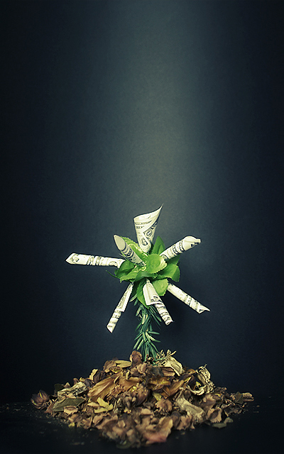
| Money tree? For me this has too much dead space and the money is so small that the message is lost. There seems to be a light stripe down the image. Perhaps a spot would have been better? A little more contrast might have helped as well. |
|
| Photographer found comment helpful. |
|
|
11/03/2008 09:38:53 AM |
|
| Photographer found comment helpful. |
|
|
11/03/2008 01:38:15 AM |
| I like it! Great concept, and well-executed. The light-coming-down definitely makes the eye think "sunlight." |
|
| Photographer found comment helpful. |
|
|
11/01/2008 09:05:31 PM |
|
| Photographer found comment helpful. |
|
|
11/01/2008 04:06:03 PM |
| Good composition and great lighting. The dark BG created a very nice contrast against the white (notes) and the green. Clever use of dried leaves added a nice touch of brown color to the composition. Nice. |
|
| Photographer found comment helpful. |
|
|
11/01/2008 06:15:01 AM |
| lol if it sprouts so much money when still so small, send me a cutting or two! lighting a little strong but great idea. 7 |
|
| Photographer found comment helpful. |
|
|
10/31/2008 05:29:39 PM |
Meets Challenge:2
Technical:2
Interestingness:2
Creativity:
TOTAL: 6 |
|
| Photographer found comment helpful. |
|
|
10/30/2008 08:19:01 PM |
| My preference would be to crop out the empty top and make it all larger to provide more detail |
|
| Photographer found comment helpful. |
|
|
10/30/2008 02:23:56 AM |
| A brilliant shot, the depth of field at the front is very nice and I love the colour and lighting of the background. |
|
| Photographer found comment helpful. |
|
|
10/29/2008 08:56:49 PM |
| aha, this is clever. very good composition. |
|
| Photographer found comment helpful. |
|
|
10/29/2008 06:39:41 AM |
| Great lighting, framing, colors. The bit at the bottom that is way less in focus than the rest is a bit distracting, I think it would look even better without selective focus. Very nice. |
|
| Photographer found comment helpful. |
|
|
10/28/2008 08:06:39 PM |
| very nice concept. lighting and colors are very good and composition is excellent. |
|
| Photographer found comment helpful. |
Home -
Challenges -
Community -
League -
Photos -
Cameras -
Lenses -
Learn -
Help -
Terms of Use -
Privacy -
Top ^
DPChallenge, and website content and design, Copyright © 2001-2025 Challenging Technologies, LLC.
All digital photo copyrights belong to the photographers and may not be used without permission.
Current Server Time: 04/07/2025 02:01:44 PM EDT.