| Author | Thread |
|
|
05/12/2004 01:24:15 AM |
| Deserved a much better score in my opinion... |
|
 Photographer found comment helpful. Photographer found comment helpful. |
Comments Made During the Challenge  |
|
|
05/11/2004 03:35:24 AM |
| I have a feeling that the uncropped image totally changes the feel of this shot. I love the feel of it - can't put my finger on how to explain it technically, but I definitely enjoyed this image. |
|
| Photographer found comment helpful. |
|
|
05/10/2004 06:28:32 PM |
Composition: Subject Placement, Cropping, Background 7
Technical: Focus, Exposure, Lighting, Processing 9
Appeal: Is it Interesting, Motivating, Etc.? 6
How well does it meet the challenge: 10
Total Averaged Rating 8.00 Dick
|
|
| Photographer found comment helpful. |
|
|
05/08/2004 01:58:57 PM |
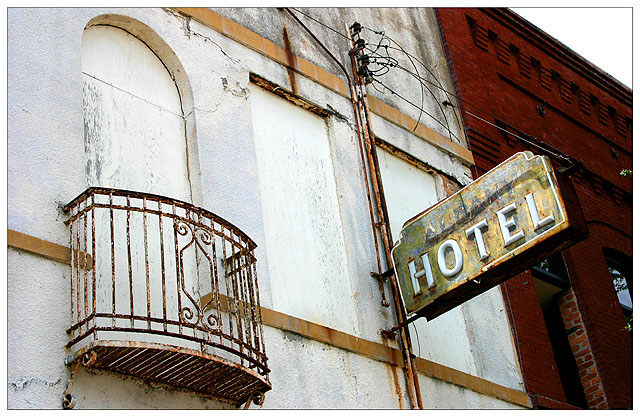
| Oooh! Lots of different rusty bits on this one, and it's lovely. I like the slant and the placing of the sign in the photograph... excellent composition. The contrast of the darker building also adds something to it. Beautiful, one of my favourites! 10 |
|
| Photographer found comment helpful. |
|
|
05/07/2004 08:14:32 AM |
|
| Photographer found comment helpful. |
|
|
05/07/2004 04:48:32 AM |
Composition: Subject Placement, Cropping, Background 6
Technical: Focus, Exposure, Lighting, Processing 6
Appeal: Is it Interesting, Motivating, Etc. 4
How well does it meet the challenge: 6
Total Averaged Rating(Rounded) 6
|
|
| Photographer found comment helpful. |
|
|
05/06/2004 08:20:19 PM |
| I think this is the first border I've ever liked. I also like the contrast between the red brick and white (stucco?) buildings. |
|
| Photographer found comment helpful. |
|
|
05/06/2004 06:33:31 PM |
| I really like this - very bright, well done - I think on of the best : ) |
|
| Photographer found comment helpful. |
|
|
05/06/2004 05:28:01 PM |
| Nice picture even with the old power line attachment. I like the colors. I just get a stiff neck looking up and prefer pictures where the photographer climbs to the level of the subject. |
|
| Photographer found comment helpful. |
|
|
05/06/2004 03:22:47 PM |
| Strange shot but I find it attractive to look at. I would like the color increased..more saturation. Nice one. |
|
| Photographer found comment helpful. |
|
|
05/06/2004 12:14:29 PM |
| I absolutely love this, except for that washed-out piece of sky in the upper right hand corner--it pulls the eye away from what is a great scene. Giving it a 9--otherwise was a solid 10. Congrats! |
|
| Photographer found comment helpful. |
|
|
05/05/2004 12:49:49 PM |
| cool perspective. Background building is a little distracting |
|
| Photographer found comment helpful. |
|
|
05/05/2004 12:24:15 PM |
| good composition, nice suttle solution to the problem, love the old sign |
|
| Photographer found comment helpful. |
|
|
05/05/2004 03:44:23 AM |
| Good perspective there is something about the tilting of this photo that bugs me, But I like it anyway, Good luck :) |
|
| Photographer found comment helpful. |
Home -
Challenges -
Community -
League -
Photos -
Cameras -
Lenses -
Learn -
Help -
Terms of Use -
Privacy -
Top ^
DPChallenge, and website content and design, Copyright © 2001-2025 Challenging Technologies, LLC.
All digital photo copyrights belong to the photographers and may not be used without permission.
Current Server Time: 04/07/2025 02:21:44 PM EDT.