| Author | Thread |
Comments Made During the Challenge  |
|
|
10/21/2008 07:53:26 AM |
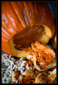
| I like the idea. I would like to see more of the subject as the bottom is cropped off a bit as well as the right side being a little tight. The lighting seems a bit harsh and a tad overexposed washing out some detail on the top. I think another thing that seems to distract the eye is the blade on the lower left and lower right. I think you're on the right track for the detail overall though and good use of DOF. Good luck! |
|
 Photographer found comment helpful. Photographer found comment helpful. |
|
|
10/20/2008 11:58:47 PM |
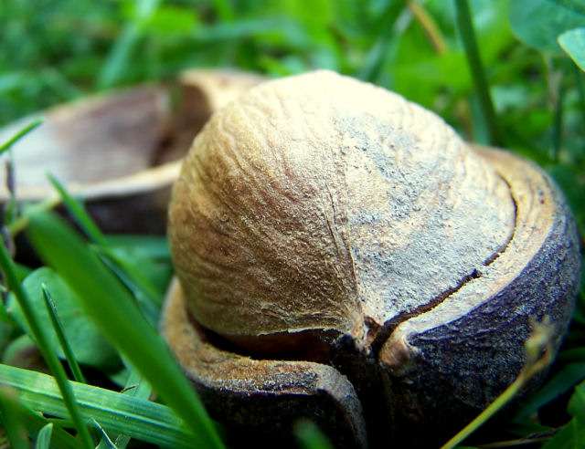
| well composed, i can see the theme in this photo very well! |
|
| Photographer found comment helpful. |
|
|
10/14/2008 08:31:34 PM |
| Nice composition,colors & exposure! |
|
| Photographer found comment helpful. |
Home -
Challenges -
Community -
League -
Photos -
Cameras -
Lenses -
Learn -
Help -
Terms of Use -
Privacy -
Top ^
DPChallenge, and website content and design, Copyright © 2001-2025 Challenging Technologies, LLC.
All digital photo copyrights belong to the photographers and may not be used without permission.
Current Server Time: 04/08/2025 01:37:13 AM EDT.