| Author | Thread |
|
|
10/20/2008 06:38:43 AM |
| Clever idea. I voted for NO - but in retrospect understand and would have voted higher... a case of voter learning by voter's mistakes here ;-) |
|
Comments Made During the Challenge  |
|
|
10/19/2008 05:30:19 PM |
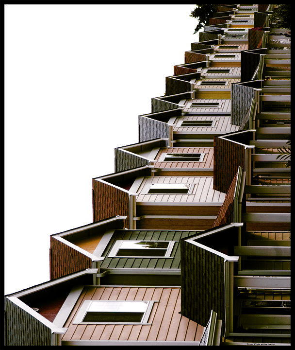
| Better in black and white? Not sure. I like how you've used the repeating pattern to emphasize conformism. |
|
|
|
10/19/2008 08:26:10 AM |
| I remember that song... oh, oh ;-) Cool shot and I really like way you've presented it. |
|
|
|
10/18/2008 07:56:24 PM |
| Love it. I think tipping it on it's back make this visually interesting. Nice job. |
|
|
|
10/18/2008 11:21:33 AM |
| An excellent photo that fits the challenge perfectly. The tilt is great: 10 |
|
|
|
10/18/2008 09:37:24 AM |
| I was hoping someone would quote that song. :-) |
|
|
|
10/17/2008 10:14:30 PM |
| Very daring 90 degree angle. Nice shot definitely showing suburbia. |
|
|
|
10/17/2008 03:14:19 AM |
| did this really need to be tipped over?? |
|
|
|
10/16/2008 07:55:32 PM |
|
|
|
10/16/2008 07:31:30 PM |
| I wonder if this was intentional; to me it would be way better the normal orientation |
|
|
|
10/16/2008 01:48:54 PM |
| IMO not sure about the pov....still I gave you a 7 |
|
|
|
10/15/2008 03:26:58 PM |
| I don't like the angle. Good pic otherwise. |
|
|
|
10/15/2008 12:05:05 PM |
| I enjoy the unconventional orientation of this pic. |
|
|
|
10/15/2008 05:33:09 AM |
| Interesting - let's say 'arresting' approach; after a while looking, I have to say I don;t quite think it succeeds - perhaps simply because its subject is too plain, so that, even rotated, it's plainly just a bunch of row-houses turned through 90 degrees. The point is, it absolutely feels like a posting mistake, rather than an artistic statement. |
|
|
|
10/14/2008 06:35:30 PM |
| Perfect captures of the challenge. The 90 degree flip really keeps it interesting and adds a lot more than if it were still horizontal. Also, having the image against the overcast sky really makes you feel that blah feeling the suburbs can carry. Great job! |
|
|
|
10/14/2008 07:40:31 AM |
this is the ultimate suburbia :D
my only problem is tilting my head sideways to get the best view. |
|
|
|
10/13/2008 11:44:12 PM |
| Nice image - Really like the subject, tones and real suburbia feel to this.... Why though did you rotate the image. I find that too distracting. Trying to make a boring subject interesting by turning it seems to have gone against you for this as I love the image the right way round - Screams suburbia. Now rotated though I find it too distracting. |
|
|
|
10/13/2008 07:08:17 PM |
| I honestly think this would have worked much better in a horizontal layout. I even don't mind the blown sky with these homes. |
|
|
|
10/13/2008 04:24:59 PM |
| Did you intend to have this shot be at right angles to what one would expect to see? Nice shot. I like the line from upper left to 1/3 on the left. |
|
|
|
10/13/2008 01:22:45 PM |
| I like this. I don't like the pain in my neck from looking at it, but I like the shot. |
|
|
|
10/13/2008 09:27:15 AM |
| awesome choice of perspective - and the quote from Pete Seeger gets you full credit! |
|
|
|
10/13/2008 07:48:13 AM |
| Little boxes, all the same. There's a green one and a pink one, And a blue one and a yellow one, And they're all made out of ticky-tacky, And they all look just the same. |
|
|
|
10/13/2008 07:03:57 AM |
|
|
|
10/13/2008 06:44:43 AM |
| its wierd, i like it... 7 |
|
|
|
10/13/2008 06:01:14 AM |
| Did you rotate this vertical intentionally ??? |
|
|
|
10/13/2008 04:36:31 AM |
| Too bad about the white sky. I really like the pale colors in the houses and the angle is creative. |
|
|
|
10/13/2008 02:03:31 AM |
| i don't get the choiche of portrait orientation.. |
|
|
|
10/12/2008 10:55:19 PM |
| That song cracks me up. This could also go in the upside down category. :~} |
|
|
|
10/12/2008 09:21:46 PM |
I was SO HOPING someone used this idea - we don't have such dwellings near us or I'd have done it.
Perfect subjects for the line - bold decision to have it verticle - not sure I love that about it though. |
|
|
|
10/12/2008 08:25:51 PM |
| really would have LOVED this landscape |
|
Home -
Challenges -
Community -
League -
Photos -
Cameras -
Lenses -
Learn -
Help -
Terms of Use -
Privacy -
Top ^
DPChallenge, and website content and design, Copyright © 2001-2025 Challenging Technologies, LLC.
All digital photo copyrights belong to the photographers and may not be used without permission.
Current Server Time: 04/07/2025 02:02:03 PM EDT.