| Author | Thread |
|
|
10/24/2008 05:35:22 PM |
Cheers from the Critique Club:
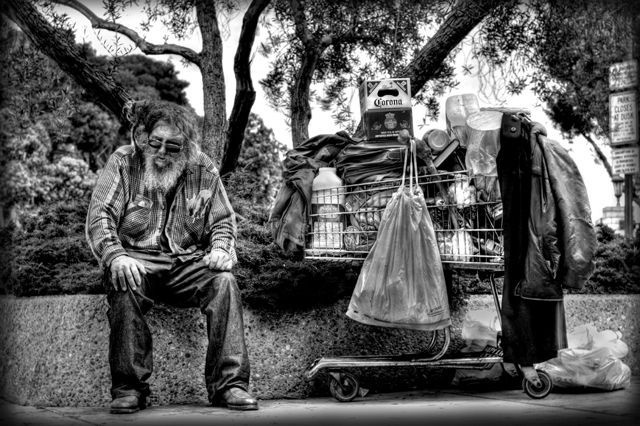
11th Place, wow. Not sure why you wanted a critique on this photo, it obviously struck a cord with the voters. Here goes.
What this photo has going for it:
You managed to use the frame in nearly a perfect way. Equal parts left/right and the tree branches spreading lines out. Very nicely done. The choice of B&W was good here, as these types of shots get a little too busy with color. The shot is well processed with a nice high contrast large tonal range. The various shapes also is a nice touch, circles, squares, lines, etc...
Scoring better:
Can't really add much here as anything above a 6 generally would just be nitpicking. I would think this photo would have done even better the Poverty Challenge.
Things to consider in the future:
Some things I would like to see. Maybe tone down the brights/contrast just a bit I think this might bring out the tonality better. Lastly, not sure if you thought this would do poorly? If you think a photo might do as well next time you might refrain from the critique club as it is probably less beneficial to you than others.
To Sum Up:
Personally, I think it is a wonderful photograph with a lot going for it. 6.1 is a terrific score and you should be happy. I don't really have much to offer in terms of improving the photo. The last part is more of a reflection what I like to see in a shot and is a matter of personal preference and in no way impacts this wonderful shot. |
|
Comments Made During the Challenge  |
|
|
10/19/2008 09:22:39 PM |
| Minor DNMC quibble: This doesn't really say suburbia to me. Could be a downtown park. That aside, GREAT composition and story. Love the processing. |
|
|
|
10/19/2008 11:26:10 AM |
| amazing, but how is that suburbia?? 8 just because its not really tight with the subject |
|
 Photographer found comment helpful. Photographer found comment helpful. |
|
|
10/17/2008 10:21:17 PM |
| please post the processing steps in the details! i'm dying to know. great shot. |
|
| Photographer found comment helpful. |
|
|
10/17/2008 03:33:52 PM |
| He has the most important thing on top lol!!! Nice image. |
|
| Photographer found comment helpful. |
|
|
10/17/2008 02:25:50 PM |
| Can't put my finger on exactly why I like this shot but its great!! |
|
| Photographer found comment helpful. |
|
|
10/17/2008 10:13:31 AM |
| Neat editing! Nice image. (not voting) |
|
| Photographer found comment helpful. |
|
|
10/17/2008 08:56:14 AM |
| Also slightly lost in background, huh? |
|
|
|
10/17/2008 12:26:41 AM |
| Very surrealistic look to it and very nicely edited. Just not sure that it screams suburbs to me. Seems that I'd see this more on an urban street than a suburban street? |
|
| Photographer found comment helpful. |
|
|
10/16/2008 11:24:09 PM |
| The image says 'city', not 'suburbia' |
|
|
|
10/15/2008 07:41:28 PM |
|
| Photographer found comment helpful. |
|
|
10/15/2008 09:08:48 AM |
| One of the three I think should and will ribbon! My only gripe is that the contrast seems just a little too sharp, but then again i'm still giving you a 9... so what do I know? =) |
|
| Photographer found comment helpful. |
|
|
10/13/2008 10:42:03 AM |
| Nice image - Like the PP on this - Almost like a drawing. Maybe just a tad fussy with all the background foliage etc. |
|
| Photographer found comment helpful. |
|
|
10/13/2008 10:12:42 AM |
| Subject doesn't quite stand out enough. |
|
| Photographer found comment helpful. |
|
|
10/13/2008 05:01:28 AM |
| love this processing and detail. my third ribbon 10 |
|
| Photographer found comment helpful. |
Home -
Challenges -
Community -
League -
Photos -
Cameras -
Lenses -
Learn -
Help -
Terms of Use -
Privacy -
Top ^
DPChallenge, and website content and design, Copyright © 2001-2026 Challenging Technologies, LLC.
All digital photo copyrights belong to the photographers and may not be used without permission.
Current Server Time: 02/01/2026 07:57:01 AM EST.