| Author | Thread |
|
|
05/10/2004 06:16:56 PM |
* Greetings from the Critique Club *
This image has a lot going for it - I'm surprised it didn't finish higher. But as you know, there were a great many excellent entries to compete with.
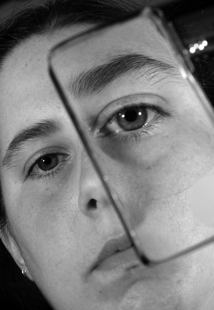
One of the common weaknesses of many entries is the lack of impact - but your image does not suffer from that. It reaches right out to the viewer and shouts "proportion" quite loudly. I don't necessarily agree with the comment that it "barely" shows proportion as the left eye is about 1.5 times the size of the right eye.
Your presentation is well done - placing the subject on a diagonal line adds some tension.
Techically, the exposure looks to be right on and the "printing" shows good black and white qualities - good clean crisp whites and some black blacks with a nice tonal range between.
I'm a bit confused by the tech data shown on the image - an f-stop of 2.8 and a shutter speed of 1/10th. I would not have thought the focus on the right ear would have remained sharp at 2.8 - given the focus is most likely centered on the eyes. And a shutter speed of 1/10 most lkely required a very still model and a tripod.
The lighting is a bit "troublesome" as well - with two catchlights in the larger eye - but just one in the smaller one.
The only minor improvement I would suggest is the removal of the bright spots just to the right of the eyelid and in the upper right corner of the image.
Overall - a great effort all the way.
|
|
 Photographer found comment helpful. Photographer found comment helpful. |
Comments Made During the Challenge  |
|
|
05/04/2004 11:28:59 PM |
| I like the attempt here and it is out of proportion, but just barely so...I would like it more out of proportion....make a great human abstract that you really don't see a lot of. Good work. |
|
| Photographer found comment helpful. |
|
|
05/04/2004 02:46:21 AM |
| Great idea for the challenge. Framing is good and also the tight crop. |
|
| Photographer found comment helpful. |
|
|
05/03/2004 04:44:46 PM |
| Simple but effective. Very nice! |
|
| Photographer found comment helpful. |
|
|
05/01/2004 11:19:37 PM |
Very interesting ... why didn't I think of that??
PS...great minds think alike, they say. I named my photo the same thing! |
|
| Photographer found comment helpful. |
|
|
05/01/2004 04:04:50 PM |
| Interesting take on the challenge. Nothing to critize photographically. Perhaps add more background for context, but I think this is pretty good as is. |
|
| Photographer found comment helpful. |
|
|
04/30/2004 01:50:01 PM |
| The composition is ok but I wonder if it would be a more startling image if just the eyes were cropped. I can see how it was problematic to make the decision on just how to present it. Clever idea. |
|
| Photographer found comment helpful. |
|
|
04/30/2004 01:34:46 AM |
| Clever idea! Held DOF very well through the glass. The very bright spots to the right of your model's forehead are unfortunate. |
|
| Photographer found comment helpful. |
|
|
04/29/2004 10:46:55 AM |
IMHO meets the challenge 100%.
Clever idea and shot very well. Good entry. I hope you do well. |
|
|
|
04/28/2004 10:08:28 AM |
|
|
|
04/28/2004 12:52:33 AM |
| thank you for taking a picture that is proportion and not scale. nicely done too. good job i like it. my only 10 !! |
|
Home -
Challenges -
Community -
League -
Photos -
Cameras -
Lenses -
Learn -
Help -
Terms of Use -
Privacy -
Top ^
DPChallenge, and website content and design, Copyright © 2001-2026 Challenging Technologies, LLC.
All digital photo copyrights belong to the photographers and may not be used without permission.
Current Server Time: 02/01/2026 07:30:11 AM EST.