| Author | Thread |
Comments Made During the Challenge  |
|
|
05/03/2004 05:15:35 PM |
| like the idea but feel the clarity on the right could have improved the shot |
|
 Photographer found comment helpful. Photographer found comment helpful. |
|
|
04/30/2004 05:30:40 AM |
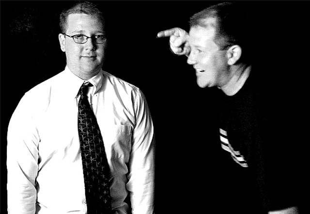
| A nice experiment that doesn't really work as you on the right is blurred and you on the left appears to have a crease running down your face! There is also some marks in the top left of image (Cannot make it out due to low resolution of monitor). |
|
| Photographer found comment helpful. |
|
|
04/29/2004 03:05:06 PM |
| i'm surprised this pic isn't blurrier. creative. |
|
| Photographer found comment helpful. |
|
|
04/29/2004 02:48:51 AM |
|
| Photographer found comment helpful. |
|
|
04/28/2004 04:15:36 PM |
| if you need to explain your photo in your title, chances are it's not that good. |
|
| Photographer found comment helpful. |
|
|
04/28/2004 02:02:49 PM |
| Clever. The line down the face on the left has something to do with the double exposure I guess... Like the grainy look. |
|
| Photographer found comment helpful. |
|
|
04/28/2004 12:58:06 PM |
| a bit of a goofy title; expressions are good, lighting on the right "subject" needs to be stronger as he/you fades into the background |
|
| Photographer found comment helpful. |
|
|
04/28/2004 12:11:58 PM |
| Without the title I don't think I would have caught on that both these images were of yourself. As a photo it has potential although I don't think you quite caught it here. There is a line of shadow running vertically down the face of you in the tie and you in the sweater are far too fuzzy and unfocused. To make a more obvious point about proportion you should have made sure your shirt and tie were much neater. At any rate, I think this is stretching the idea of proportion a bit. Sure there is contrast between a working stiff and a casual guy in a sweater but I don't think that really illustrates proportion or lack of proportion. |
|
| Photographer found comment helpful. |
|
|
04/28/2004 11:42:07 AM |
| It seems a little bit blured to me plus the guy on the left has a line running through his left eye. otherwise not bad |
|
| Photographer found comment helpful. |
|
|
04/28/2004 03:48:24 AM |
|
| Photographer found comment helpful. |
|
|
04/27/2004 08:18:43 PM |
| interesting work visually... the title stinks. "Explanations" are so degrading when used in the titles... just my humble opinion... |
|
| Photographer found comment helpful. |
Home -
Challenges -
Community -
League -
Photos -
Cameras -
Lenses -
Learn -
Help -
Terms of Use -
Privacy -
Top ^
DPChallenge, and website content and design, Copyright © 2001-2025 Challenging Technologies, LLC.
All digital photo copyrights belong to the photographers and may not be used without permission.
Current Server Time: 04/07/2025 12:13:38 AM EDT.