| Author | Thread |
Comments Made During the Challenge  |
|
|
10/26/2002 08:39:00 PM |
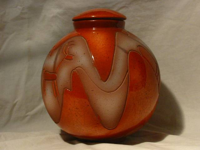
| try moving this farther away from the background so the bg is more blurred .. light your object maybe from behind. dont put it smack in the middl eof the frame, either. mag99 |
|
|
|
10/26/2002 05:05:00 PM |
| My door has been that! (Ajar... ok, it's not that funny.) Nice shadows. |
|
|
|
10/24/2002 05:48:00 PM |
| need to have the object farther away from the background and iron the background |
|
|
|
10/24/2002 08:43:00 AM |
| Why, yes it is. But a lovely jar at that. I love the color and the curved lines are great. I think it seems a slight bit tilted, and your backdrop could use some ironing. Other than that though, everything else is very nice. The focus is good, the framing/cropping are great. Lighting is wonderful. Good luck in the challenge. ~Hbunch7187~ |
|
|
|
10/24/2002 04:32:00 AM |
| Pull this away from the background, and the DOF will blur away the ugliness of the sheet for you. |
|
|
|
10/23/2002 06:26:00 PM |
| I would have ironed the backdrop, and then changed the white balance a little to get a whiter background, but this is a good looking jar. 7 nards656 |
|
|
|
10/23/2002 06:16:00 AM |
I understand how hard it is to find a subject. I looked all over my house and finally decided on a rose. good lighting, but if a black sheet or cloth would have made the vase stand out more. Good job.
Vote6
Sonifo |
|
|
|
10/22/2002 11:06:00 AM |
the background could of had less creases and probably better lit.. you have adhered to the challenge though so I'll go with a 5
|
|
|
|
10/22/2002 05:43:00 AM |
| It's a pretty jar with beautiful texture and colors. Your light just doesn't do enough to emphasize it. The shadow is a nice touch, but maybe your light could have been a little closer, or perhaps brighter. |
|
|
|
10/21/2002 07:57:00 PM |
| I think the shadow is too strong, and You should have detached the jar from the background. Nothing really interesting to mee expects the reds and browns. |
|
|
|
10/21/2002 11:32:00 AM |
| A Jar it is. But poorly lit it is too. Framinc ould be better. 3 |
|
|
|
10/21/2002 05:40:00 AM |
| Pretty jar, needs a better background. |
|
Home -
Challenges -
Community -
League -
Photos -
Cameras -
Lenses -
Learn -
Help -
Terms of Use -
Privacy -
Top ^
DPChallenge, and website content and design, Copyright © 2001-2025 Challenging Technologies, LLC.
All digital photo copyrights belong to the photographers and may not be used without permission.
Current Server Time: 04/09/2025 12:03:49 PM EDT.