| Author | Thread |
|
|
10/10/2008 11:51:20 AM |
You came in the top 1/3 of all the pictures, that is quite an accomplishment especially for your first studio shot.
Everyone is going to have different opinions on the overall quality of the photo.
I think preserving the burnt out highlights in the hair might have helped. I am personally not a fan of a lot of white space, others are. I personally like the pose, others might not.
The point here is that if you want a shot that scores "extremely" well then you need to appeal to all of the voters. This shot isn't bad, it is quite good but it is not going to appeal to everyone equally.
5.7 nothing to scoff at, especially considering it is your first attempt. Much better than I could do. Congrats. |
|
 Photographer found comment helpful. Photographer found comment helpful. |
|
|
10/10/2008 10:38:12 AM |
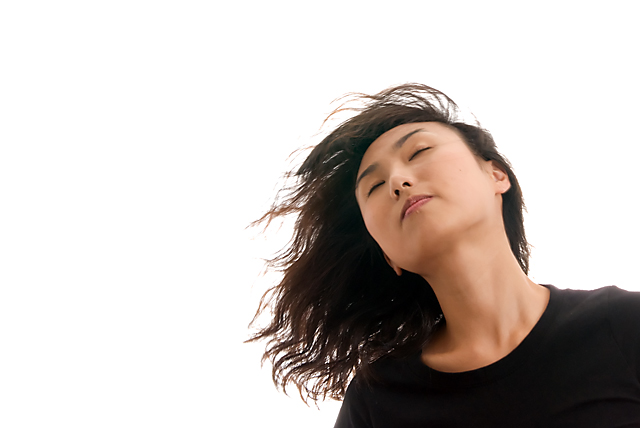
| Saw your post asking for comments.... I really like this picture. It's nicely composed, and the model is in an interesting position, which sets this pic aside from the "norm". The only thing that is a little distracting to me is that it looks like the backlight was too bright. You can see this by her right shoulder - it's a bit blown out. Also, some of her whispies in her hair are lost and a bit overexposed as well. Although, the light ON the model is great, but just a tad bit bright because the backlight looks a bit too bright. -Hope this helps. Magen |
|
| Photographer found comment helpful. |
|
|
10/10/2008 08:53:36 AM |
'...give me a few hints, tips, suggestions...What I'd really like would be some constructive feedback from anyone who knows more about this field than I (most everyone...) So if you have a moment...'
I'm no expert and have no studio experience. However, I have been looking at photos for a while: I hope that counts for something. I rated your photo at 8. I thought it was excellent photographically speaking: maybe slightly overly bright? I didn't give it a 10 because I felt it didn't have a 'Portrait' feeling and as much as I don't like centered objects/people, I felt Portraits done in a studio were generally done that way. I hope that might help somewhat...I'm sure others will have much better answers for you... |
|
| Photographer found comment helpful. |
Comments Made During the Challenge  |
|
|
10/01/2008 09:43:09 AM |
Wonderful placement of the model in the frame. Love the white space.
There are subtle geometries that come to light after studying this shot - a slight convex in the shape of her eyebrows becomes a bit more pronounced in her eyelashes and even moreso in the joining of her lips. This is accentuated by the incredible smoothness in her skin. These curves are offset by the concave neckline of her top. Also, length of her neck carries similar soft curves on either side. This pattern is carried through the tips of her hair.
The lighting on the skin is superb as the highlights and soft shadows blend very well and are very balanced.
Personally, I like the fact that her eyes are closed as this allows for a broader area of attention - as opposed to the eyes being a focal point. |
|
| Photographer found comment helpful. |
Home -
Challenges -
Community -
League -
Photos -
Cameras -
Lenses -
Learn -
Help -
Terms of Use -
Privacy -
Top ^
DPChallenge, and website content and design, Copyright © 2001-2025 Challenging Technologies, LLC.
All digital photo copyrights belong to the photographers and may not be used without permission.
Current Server Time: 04/07/2025 02:17:35 AM EDT.