I wonder how many people will recognise this after me gloating about my new lens and my trip to France. :) Hopefully nobody paid attention.
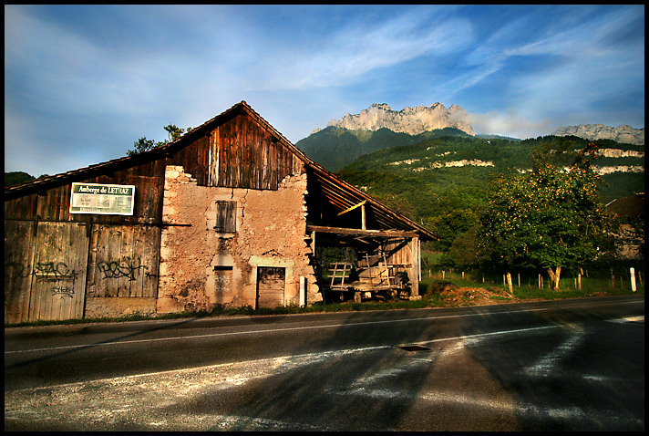
This is an early morning shot of a barn over the road from my hotel. The mountain in the background is the launch site for paragliders.
Editing was a bit of D&B, cloning my own shadow out of the foreground. I originally had selected another image for this, but after editing, I really didn't like the other one, so switched to this one instead. As a change from recent months, I've actually had more than one image to choose from, which is really nice. Editing was done on my laptop, which is very frustrating, as different applications show the colours very differently! (and yes, I have calibrated the laptop - probably part of the problem)
I'm not sure how this will go, but I did pick it for it's DPC qualities, so I hope it does OK.
Post-challenge - wow, very surprising. I think despite calibration, my laptop is giving very strange results. I actually thought this was a potential ribbon image, but it's way out. Looking at it on a decent monitor, is has a wierd pink tinge on the building (it was meant to be more orange), and I think the slight desat was a bad idea. I could have done a little more burning in for better contrast. The image is slightly crooked, but I didn't think it was a bad thing, so I left it. I had considered a movie-frame with black bars top and bottom, and maybe that would have helped.
Statistics
Place: 181 out of 430 Avg (all users): 5.7792 Avg (commenters): 6.0000 Avg (participants): 5.7353 Avg (non-participants): 5.8654 Views since voting: 733 Views during voting: 223 Votes: 154 Comments: 5 Favorites: 0
This is the kind of subject that generally attracts my eye. However a far more difficult subject to shoot successfully then one might think. The main problem is distracting detail that takes from the image.
The old barn almost looks timeless but it is a pity about the sign. The roadway and strange looking shadows do not help your image in any way. It would have been best to exclude as much as possible of it in your image.
I love the rich colours in the image. I have a feeling you have increased saturation a bit, which does no harm. But it may be that little bit too strong.
I agree with the shadow part in the foreground, its a bit strange and distracting. But I do like the colors and the old house (would have loved to see all of it though... :o) But the score is ok!!
I voted a 6 and like it overall, colours and composition. But it is hard to stand alone against some of the photos in such a challenge. I think the grade was pretty good considering.
David - I think you captured the wonderul low angle light very well here. The warm tones, the richness of the details all works well in the photo. In addition, the use of the roofline to mirror the mountain shows good compositional appeal. With all that, the shadows on the road really hurt the image. Also, the fact that the road looks a bit 'muddy' from a details perspective did not help the DPC crowd.
I gave it a 6 for the comp and lighting perspective - but the road and shadows issues brought it down from the 8-9 I wanted to give it.
I wonder what those dark areas in the foreground right and center are, looks like some weird editing traces (maybe from cloning out your shadow?)
The colors really seem to be a little off- The cropped house bothers me a bit, would have been better with an even wider angle or some steps backwards (if possible).