| Author | Thread |
|
|
09/20/2008 01:54:06 PM |
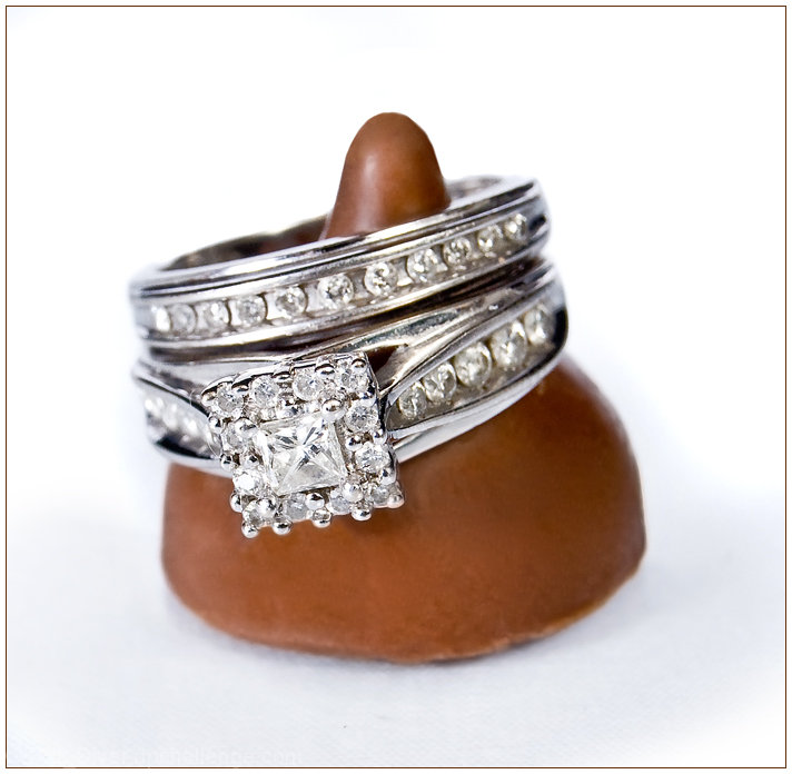
The bottom ring looks really good. You needed more DOF to make the second ring look sharp, and yes, Hersheys look lousy this up close.
The kiss is not pointy enough, perhaps you could have shaven it? Or maybe it was starting to melt with all the lighting? LOL |
|
 Photographer found comment helpful. Photographer found comment helpful. |
Comments Made During the Challenge  |
|
|
09/14/2008 06:07:38 PM |
| Great concept now that I get it. It took me a few views and minutes to get the "kiss" part. Maybe its me but I don't think I've ever seen a Hershey kiss with a top quite that round. |
|
| Photographer found comment helpful. |
|
|
09/14/2008 04:01:23 PM |
|
| Photographer found comment helpful. |
|
|
09/14/2008 09:24:57 AM |
| The ring is beautiful...the chocolate kiss is not. I actually didn't know it was chocolate until I read your title. I think that the Kiss took away from your image. |
|
| Photographer found comment helpful. |
|
|
09/12/2008 07:59:26 PM |
| An excellent idea - but I'm having a little trouble with the focus. 7 |
|
| Photographer found comment helpful. |
|
|
09/11/2008 07:41:31 PM |
| Nice idea and setup. Lighting does not do much to display the brilliance/fire of the center diamond. Also the chocolate lacks a rich feel and looks, well, cheap like hershey's. |
|
| Photographer found comment helpful. |
|
|
09/11/2008 06:00:39 PM |
Of course I can't help but compare it to this photo:

I think you did a good job recreating it. Lighting is brighter (a good thing), DOF is shallower (maybe not a good thing). |
|
| Photographer found comment helpful. |
|
|
09/11/2008 10:34:02 AM |
| I feel the dof is a bit shallow, could be a bit sharper. Clever idea and well lit. |
|
| Photographer found comment helpful. |
|
|
09/10/2008 11:09:37 PM |
|
| Photographer found comment helpful. |
|
|
09/10/2008 07:36:35 PM |
| too shallow DOF, at least the ring should be in focus. don't know if a kiss is quite the right prop to use. |
|
| Photographer found comment helpful. |
|
|
09/09/2008 05:46:00 PM |
| I'm not sure I like the shape of that brown thing. Also, I don't know if I like the blurry edges so much. |
|
| Photographer found comment helpful. |
|
|
09/09/2008 05:17:15 PM |
Fit Challenge Criteria: 2/2
Contrast/Color: 0/2
Composition: 1/2
Photo Quality: 1/2
My Subjective Affinity: 1/2
This is such a hard shot to accomplish. The kiss really needs to be a darker, richer brown. It also needs to be either included more in the DOF, or further outside the realm of focus. The diamonds lack the contrast/sparkle that jewelry photography is known for. |
|
| Photographer found comment helpful. |
|
|
09/09/2008 02:19:57 PM |
|
| Photographer found comment helpful. |
|
|
09/09/2008 08:59:42 AM |
| Very clever, it actually took me several looks at this to realise what the ring is sitting on (we don't have those in Scotland.) Great lighting. |
|
| Photographer found comment helpful. |
|
|
09/08/2008 01:29:56 PM |
| this is quite lovely. it makes me want some chocolate(i already want shiny things:) |
|
| Photographer found comment helpful. |
|
|
09/08/2008 11:59:52 AM |
| This is a really good shot, I think however the dark chocolate brown is really distracting and perhaps a white hershies kiss wouldve been better for this 7 |
|
| Photographer found comment helpful. |
|
|
09/08/2008 01:02:43 AM |
| Beautiful rings .. chocolate could have been a bit darker to show off the rings |
|
| Photographer found comment helpful. |
Home -
Challenges -
Community -
League -
Photos -
Cameras -
Lenses -
Learn -
Help -
Terms of Use -
Privacy -
Top ^
DPChallenge, and website content and design, Copyright © 2001-2026 Challenging Technologies, LLC.
All digital photo copyrights belong to the photographers and may not be used without permission.
Current Server Time: 02/01/2026 05:54:46 AM EST.