| Author | Thread |
|
|
09/15/2008 09:05:43 AM |
| Sorry this didn't do better. I guess you needed to add some water drops to it for the DPC crowd to vote it higher. LOL |
|
 Photographer found comment helpful. Photographer found comment helpful. |
|
|
09/15/2008 12:34:39 AM |
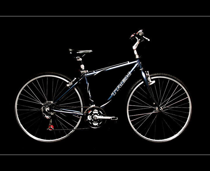
| I think I would have liked to have seen this on either a white background or some lighting from behind to separate the bike from the black color. It does look sharp and clean tho and I never noticed the pixelation lol. |
|
| Photographer found comment helpful. |
Comments Made During the Challenge  |
|
|
09/14/2008 09:29:29 PM |
| At first glance its an outstanding shot but after looking at it a bit its hard to distinguish the individual components. As a cyclist myself I tend to look deep at the gears, brakes, and other parts of a bike when viewing ads. I really like the border lines you added to the shot. |
|
| Photographer found comment helpful. |
|
|
09/13/2008 08:20:53 PM |
| What happened to the spokes did your editing go wrong |
|
|
|
09/12/2008 08:39:36 PM |
| I think this is perfect. The border is very different: 10 |
|
| Photographer found comment helpful. |
|
|
09/12/2008 07:19:58 PM |
| Like the look of the bike on the black backdrop. |
|
| Photographer found comment helpful. |
|
|
09/11/2008 10:25:21 PM |
| Lighting on this is off IMHO there there needs to be separation of the wheeels saddle and pedals |
|
| Photographer found comment helpful. |
|
|
09/09/2008 06:43:48 PM |
| Not enough separation from the dark background. A lot of the details on the bike (seat, tires, chain... ) get lost as they blend into the background. |
|
| Photographer found comment helpful. |
|
|
09/09/2008 04:45:16 PM |
Fit Challenge Criteria: 2/2
Contrast/Color: 1/2
Composition: 2/2
Photo Quality: 2/2
My Subjective Affinity: 2/2
Excellent idea. The lighting is a bit harsh, leaving a bit to be desired, especially with the tires and seat. Aside from the lighting problem, everything else looks great. |
|
| Photographer found comment helpful. |
|
|
09/09/2008 09:33:12 AM |
| Great crop and I like that white top-bottom border. |
|
| Photographer found comment helpful. |
|
|
09/09/2008 02:08:54 AM |
|
| Photographer found comment helpful. |
|
|
09/08/2008 08:08:46 PM |
| I like the border & black background. Photo is sharp & looks like it could be in a Trek catalogue. |
|
| Photographer found comment helpful. |
|
|
09/08/2008 01:36:19 PM |
| this is a very good photo for this challenge. good choice going with the black background |
|
| Photographer found comment helpful. |
|
|
09/08/2008 11:04:42 AM |
| Nicely presented. I can see this in a glossy magazine. |
|
| Photographer found comment helpful. |
|
|
09/08/2008 12:39:56 AM |
| I could have done without the white lines at top and bottom .. otherwise nicely done |
|
| Photographer found comment helpful. |
Home -
Challenges -
Community -
League -
Photos -
Cameras -
Lenses -
Learn -
Help -
Terms of Use -
Privacy -
Top ^
DPChallenge, and website content and design, Copyright © 2001-2026 Challenging Technologies, LLC.
All digital photo copyrights belong to the photographers and may not be used without permission.
Current Server Time: 02/01/2026 05:54:08 AM EST.