| Author | Thread |
Comments Made During the Challenge  |
|
|
09/14/2008 09:50:52 PM |
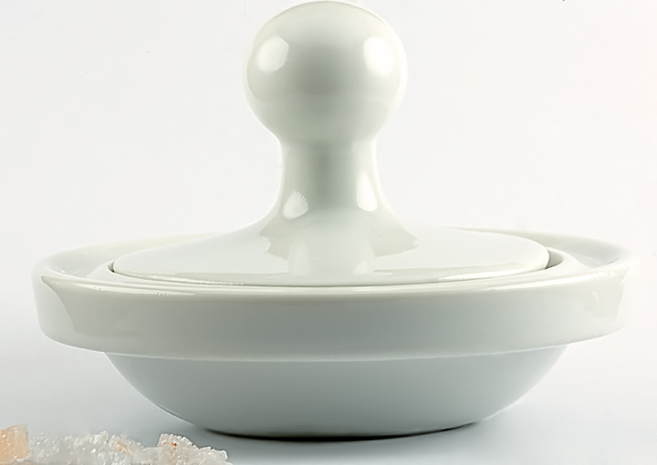
| I would like to have seen this on something other than a white background. You do an excellent job of capturing the softness of the white on the product. It may not have appeared that good with something like a black or blue background. |
|
 Photographer found comment helpful. Photographer found comment helpful. |
|
|
09/13/2008 08:55:49 PM |
| I love the white image with the white background! Gorgeous! |
|
| Photographer found comment helpful. |
|
|
09/12/2008 10:43:52 PM |
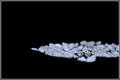
| Nice image, good lines, but what is that in the foreground!? |
|
| Photographer found comment helpful. |
|
|
09/10/2008 10:56:24 PM |
| Not sure what is on bottom left and don't like close crop on top |
|
| Photographer found comment helpful. |
|
|
09/09/2008 05:38:02 PM |
| Highlights blown out a bit lose some of the edge of the object, and the cropping is a bit off: top of the object barely makes it into the frame, and the crushed (salt?) at the bottom corner is unbalanced and distracting. |
|
| Photographer found comment helpful. |
|
|
09/09/2008 02:21:59 PM |
Fit Challenge Criteria: 2/2
Contrast/Color: 1/2
Composition: 1/2
Photo Quality: 1/2
My Subjective Affinity: 0/2
The object in the foreground is very distracting, and it is not apparant what it is. The lighting is a bit harsh for my tastes. Just a bit too bright along the right side of the product. The cropping is also really tight on the upper edge of the photograph. |
|
| Photographer found comment helpful. |
|
|
09/09/2008 09:59:16 AM |
| Whatever the stuff in the bottom left is, it kinda distracts and the crop is just a wee bit tight on top. |
|
| Photographer found comment helpful. |
|
|
09/09/2008 02:05:11 AM |
|
| Photographer found comment helpful. |
|
|
09/08/2008 01:39:16 PM |
| this seems a bit crooked to me. the sugary stuff in the corner wasn't necessary, i think going with just the simple mortar would gave been great |
|
| Photographer found comment helpful. |
|
|
09/08/2008 07:39:57 AM |
| I personally would have used a wider crop at the top. |
|
| Photographer found comment helpful. |
|
|
09/08/2008 12:28:02 AM |
| Could have been straightened a bit more, crop is too close at the top. What ever is in the lower left is just a distraction. |
|
| Photographer found comment helpful. |
Home -
Challenges -
Community -
League -
Photos -
Cameras -
Lenses -
Learn -
Help -
Terms of Use -
Privacy -
Top ^
DPChallenge, and website content and design, Copyright © 2001-2026 Challenging Technologies, LLC.
All digital photo copyrights belong to the photographers and may not be used without permission.
Current Server Time: 02/01/2026 11:08:33 AM EST.