| Author | Thread |
Comments Made During the Challenge  |
|
|
10/27/2002 02:28:00 PM |
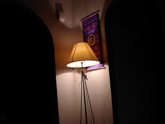
| Your light is in the exact center, a big no-no. Why? Because it makes your pic boring. Remember the rule of thirds and put the light off to the right or to the left with all the dark and you'd have a good pic. Good luck! |
|
|
|
10/26/2002 07:46:00 AM |
Not very interesting.
Vote 4
Sonifo |
|
|
|
10/24/2002 11:59:00 AM |
| nice, but u could of done better |
|
|
|
10/24/2002 03:02:00 AM |
|
|
|
10/22/2002 06:14:00 PM |
| This needs to be straighter! |
|
|
|
10/22/2002 04:36:00 PM |
| Nice composition...except for the fact that i think this particular photo would look better with the subject centered, almost like a symetrical piece |
|
|
|
10/22/2002 12:54:00 PM |
| Safari Lamp! Sorry, didn't do much for me. Very clear photo. 6 Swash |
|
|
|
10/21/2002 06:36:00 PM |
I see the single light source, but don`t get what you are trying to light up as
the subject. The wall? -Clicker- |
|
|
|
10/21/2002 11:23:00 AM |
| This photo has very little 'subjective' impact. "What" you choose to photograph is very important. It's half the battle. "How" you choose to photograph it is the other half. When you create a nice combination and balance between the two, you will have great shots :) - setzler |
|
|
|
10/21/2002 10:05:00 AM |
| I feel that the tilt distracts from the shot |
|
|
|
10/21/2002 04:46:00 AM |
| hmmm, lacking a bit in the creativity area here...5 |
|
|
|
10/20/2002 08:40:00 PM |
| Good attempt, but rather boring though. No offense, but i think you could have done better. |
|
Home -
Challenges -
Community -
League -
Photos -
Cameras -
Lenses -
Learn -
Help -
Terms of Use -
Privacy -
Top ^
DPChallenge, and website content and design, Copyright © 2001-2025 Challenging Technologies, LLC.
All digital photo copyrights belong to the photographers and may not be used without permission.
Current Server Time: 04/07/2025 12:07:07 AM EDT.