| Author | Thread |
|
|
09/13/2008 07:18:35 PM |
Critique Club Review:
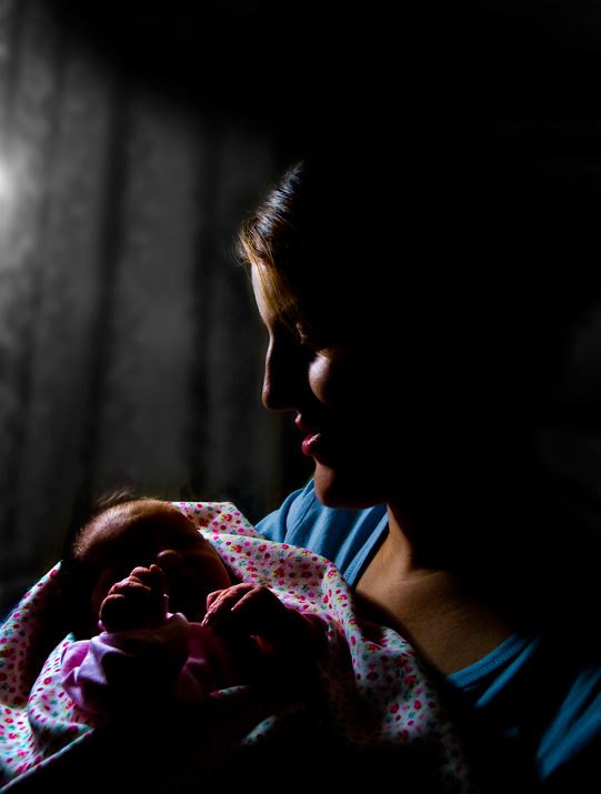
Color Saturation and Hue: Colors are vivid, saturation is appropriate for this image, and hues are natural.
Brightness and Contrast: Either you like this style or you don't. The lighting is angular and there is plenty of contrast. Personally I like the lighting and the contrast. However, I think people are used to seeing babies rendered brightly and softly. This style of lighting is harder and harsher. It would work better with adults or teens. The angle of the light emphasizes texture, and in this case makes the baby's hands look wrinkled. I believe that what the voters might have liked a little better is to be able to see more of the baby's face. Faceless things are usually scary. A very light fill, so that more detail could be seen, might have gotten you more votes.
Focus and depth of field. Both are excellent. The focus is sharp all the way to the back of the subject, but the background is softened so as not to distract. Nice work.
As I sit with the image a bit. I think that if the light had been softer and warmer, this would have improved your score. A soft box, and a gold tint to the light would really warm this image up. |
|
 Photographer found comment helpful. Photographer found comment helpful. |
Comments Made During the Challenge  |
|
|
09/05/2008 02:27:01 AM |
| I don't like the lighting. It's too dark and moody for a shot like this. |
|
| Photographer found comment helpful. |
|
|
09/02/2008 11:21:14 AM |
| Too many shadows to see any detail |
|
| Photographer found comment helpful. |
|
|
09/01/2008 09:19:35 AM |
| contrast is a little strong, and would have liked to see more light on the subjects. but that aside, i love the image and the simple beauty it portrays |
|
| Photographer found comment helpful. |
Home -
Challenges -
Community -
League -
Photos -
Cameras -
Lenses -
Learn -
Help -
Terms of Use -
Privacy -
Top ^
DPChallenge, and website content and design, Copyright © 2001-2025 Challenging Technologies, LLC.
All digital photo copyrights belong to the photographers and may not be used without permission.
Current Server Time: 04/07/2025 01:54:05 PM EDT.