| Author | Thread |
|
|
08/05/2008 12:30:49 PM |
CRITIQUE CLUB CRITIQUE
by karmat
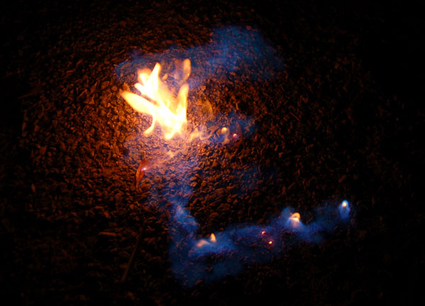
Interesting idea. I think if the background had been less textured, the "E" would have shown up better. Of course, it may have burned your background up, as well. :)
The focus and colors are good -- no major suggestions there.
The biggest thing I would look at is experimenting with crops. This one feels very centered, and leads it to seem static-y.
Perhaps the "E" in a corner with a lot of negative space would have been cool, or soemthing like that -- anything to draw attention to the fire.
A neat idea, though, and one that I think could really grow into something compelling and unique with some practice. |
|
 Photographer found comment helpful. Photographer found comment helpful. |
Comments Made During the Challenge  |
|
|
07/27/2008 09:19:40 AM |
|
| Photographer found comment helpful. |
|
|
07/26/2008 12:13:41 PM |
mmmmmmmmmmm? You drank it? lol
Next time try naphtha, and be very very careful. |
|
| Photographer found comment helpful. |
Home -
Challenges -
Community -
League -
Photos -
Cameras -
Lenses -
Learn -
Help -
Terms of Use -
Privacy -
Top ^
DPChallenge, and website content and design, Copyright © 2001-2025 Challenging Technologies, LLC.
All digital photo copyrights belong to the photographers and may not be used without permission.
Current Server Time: 04/07/2025 02:12:31 AM EDT.