CRITIQUE CLUB CRITIQUE
by karmat
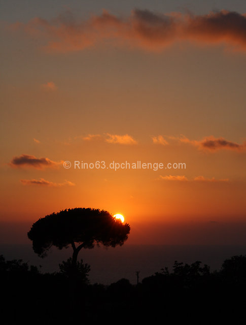
Compositionally, I really like the placement of the tree and the "layers" in the sky. All of that combines to make a really nice, balanced composition.
Technically, the silhouette is nice, and you have done well not to "blow out" the sun.
Overall, I think this is a lovely image and very nicely done. It definitely conveys the idea of "heat" to me. The subject matter, unfortunately, may have made some voters gloss over it, but the score is respectable. It does seem a touch "flat" to me, and while this may happen some with silhoettes, I'm not sure of the best way to correct it, other than making more of the background visible.
Best to you in future challenges.
Karma |