| Author | Thread |
Comments Made During the Challenge  |
|
|
07/22/2008 06:12:38 PM |
| Looks perfectly coordinated. Good color placement. |
|
 Photographer found comment helpful. Photographer found comment helpful. |
|
|
07/19/2008 09:13:36 AM |
|
| Photographer found comment helpful. |
|
|
07/18/2008 08:25:38 PM |
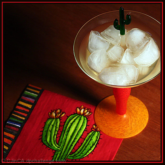
| simple, i like it. the cup being cut out on the one side makes me think about it. |
|
| Photographer found comment helpful. |
|
|
07/18/2008 03:23:31 PM |
| Love the color scheme & composition it all blends really well. Front page at the very least imho. |
|
| Photographer found comment helpful. |
|
|
07/17/2008 07:23:45 PM |
| No salt! Come on, much better with the salt! Great composition and use of the shadow for negative space. Perspective is made more interesting by the top left corner.Good job. I'm not a fan of this type of border. |
|
| Photographer found comment helpful. |
|
|
07/17/2008 12:59:59 PM |
| nice use of two cacti, and composition is very pleasing to the eye |
|
| Photographer found comment helpful. |
Home -
Challenges -
Community -
League -
Photos -
Cameras -
Lenses -
Learn -
Help -
Terms of Use -
Privacy -
Top ^
DPChallenge, and website content and design, Copyright © 2001-2025 Challenging Technologies, LLC.
All digital photo copyrights belong to the photographers and may not be used without permission.
Current Server Time: 04/08/2025 05:05:08 AM EDT.