| Photograph Information |
Photographer's Comments |
Challenge: Window View (Advanced Editing I)
Camera: Canon PowerShot G5
Location: Home, looking out a bedroom window
Date: Apr 11, 2004
Aperture: F/5
ISO: 50
Shutter: 1/200 sec
Galleries: Landscape, Nature
Date Uploaded: Apr 11, 2004
|
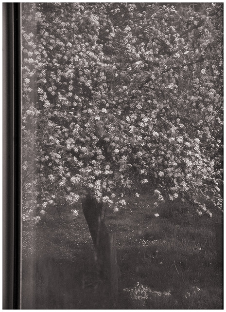
I decided to leave the window dirty for this picture because the frame was simply too ugly to leave in... I cropped a bit of it out, but you can still see the awful metal edges. This tree is out in the back yard and it looks so pretty in the spring.
I did quite a bit of editing on this one. There was some junk piled in my neighbour's yard, so I cloned it out and did some dodging and burning for blending. The photo was originally in colour and I decided to convert it to b&w and add some slight pinkish colouring; I also rotated and, as I said, cropped some of the nasty window frame out. I wanted to leave some of it, though, in case the glass wasn't obvious enough, which it should be. Curves and levels were also tweaked, and I did some sharpening with fading.
I had a difficult time with this, as all of my favourite window pictures ended up not showing the glass obviously enough and didn't include the frame. |
| Author | Thread |
|
|
04/18/2004 09:37:01 PM |
| Thanks Jason and the [few] others who understood my intentions with this photo. :) I wasn't expecting a great score, but I'm a little disappointed that it didn't break 5. I guess old fashioned is not the way to go here. |
|
|
|
04/18/2004 09:27:28 PM |
| I am the only person who gave this a 10. I can't believe it didn't even break 5. Goes to show not everyone likes the same thing. |
|
 Photographer found comment helpful. Photographer found comment helpful. |
Comments Made During the Challenge  |
|
|
04/17/2004 07:39:20 AM |
| Very nice. this might have been slightly better in colour, IMO. Not scoring you low for it tho, jus tin case you were wondering. |
|
| Photographer found comment helpful. |
|
|
04/15/2004 06:59:49 PM |
| Sorry...I really think you needed color to pull this one off...it does nothing for me. |
|
| Photographer found comment helpful. |
|
|
04/14/2004 09:55:34 AM |
|
| Photographer found comment helpful. |
|
|
04/13/2004 06:50:33 PM |
| This is a 10. Has the feel of film. Lovely work. |
|
| Photographer found comment helpful. |
|
|
04/13/2004 08:23:46 AM |
| It's a beautiful tree, but the window reflections distract a lot from the impact of the photo. Maybe increasing the contrast would help. I'm not convinced that B&W is an improvement, blossom should be colorful IMO. |
|
| Photographer found comment helpful. |
|
|
04/13/2004 04:48:52 AM |
| This shot would be improved by going outside and not worrying about the window. |
|
| Photographer found comment helpful. |
|
|
04/12/2004 02:04:41 PM |
| There's just not enough contrast to jump out at you. Maybe the color version would have had more character? Spring is so full of color that it just seems odd in B&W |
|
| Photographer found comment helpful. |
|
|
04/11/2004 08:47:02 PM |
| This may just be me but I have to think this would look better in color. |
|
| Photographer found comment helpful. |
Home -
Challenges -
Community -
League -
Photos -
Cameras -
Lenses -
Learn -
Help -
Terms of Use -
Privacy -
Top ^
DPChallenge, and website content and design, Copyright © 2001-2025 Challenging Technologies, LLC.
All digital photo copyrights belong to the photographers and may not be used without permission.
Current Server Time: 04/07/2025 12:59:06 PM EDT.