Critique Club Review:
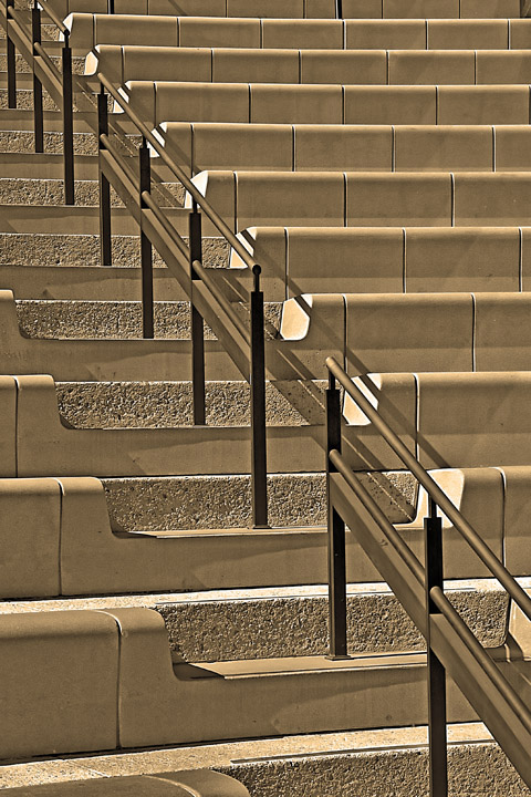
Color Saturation and Hue: Colors are not realistic, but do work very well with this composition. Nice touch...
Brightness and contrast: Very well done. The sides of a couple of steps in the upper third of the picture are approaching burnout, but they are not distracting and do not really harm the image.
Focus and depth of field: Excellent Sharpness and detail are held throughout the image, which is what is needed in this type of compostition. I do agree however, with a previous comment that the image may have been a little over processed. The image looks over sharpened in a few areas.
Although the line is broken, I don't think it really hurt you. It takes a bit of sitting with the image to notice it. Even then the shadows carry through, which is why it isn't more noticeable, and not harming the image.
I like the sepia effect. It helps warm the image, and it would have been a colder harsher image had you left it natural.
You made a well deserved upper half of the class, but why did this image not score higher? (Personally I really like this image and could see it in a gallery or office.) I like the tone of the colors, I like the roughness of the back of the steps as a counter point to the soothness of the rest of the image. I like the nice clean lines.
Though not noted in the comments below, you may have recieved a bit lower vote because the litteralists will see more than one line. Which can happen all too often.
Nice work! |