| Author | Thread |
Comments Made During the Challenge  |
|
|
04/19/2004 02:19:42 AM |
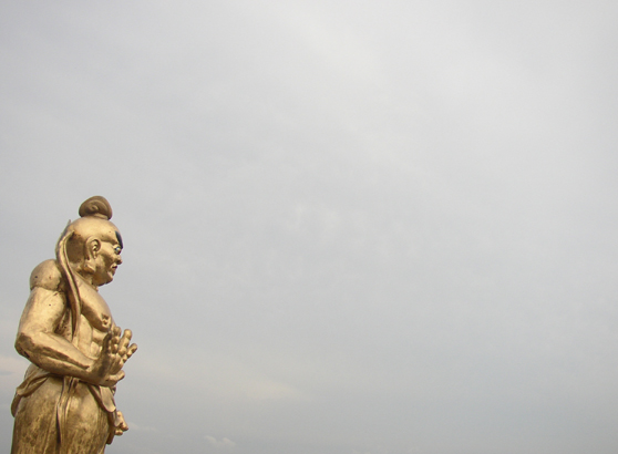
| Really interesting picture. To my eyes, the subject is just too far over in the corner and there's too much empty space. |
|
 Photographer found comment helpful. Photographer found comment helpful. |
|
|
04/18/2004 12:47:05 PM |
| Good technique, but I think I would like the composition better if our Hero wasn't crammed in the corner. Perhpaps tilting the camera a little so that he is leaning back to look up into the sky (or at least standing straight) and cropping with a bit more air behind him. |
|
| Photographer found comment helpful. |
|
|
04/18/2004 04:09:14 AM |
| The sky is rather bare. Perhaps a tighter crop would have worked better. |
|
| Photographer found comment helpful. |
|
|
04/18/2004 01:33:38 AM |
| no composition...leaves you thinking it was a fast unthought out shot |
|
| Photographer found comment helpful. |
|
|
04/16/2004 04:33:06 PM |
| talk to the hand??? ... not sure it meets the challenges |
|
| Photographer found comment helpful. |
|
|
04/16/2004 03:43:44 PM |
| i like the way you framed this |
|
| Photographer found comment helpful. |
|
|
04/16/2004 01:21:17 PM |
| Yikes, too much empty space here! |
|
| Photographer found comment helpful. |
|
|
04/15/2004 05:27:35 AM |
| Statue seems to be leaning to the right. |
|
| Photographer found comment helpful. |
|
|
04/14/2004 11:53:16 PM |
| Maybe I'm dumb but I just don't understand this image |
|
| Photographer found comment helpful. |
|
|
04/14/2004 06:00:34 PM |
| I like the composition -- too bad the weather wasn't cooperating... |
|
| Photographer found comment helpful. |
|
|
04/14/2004 11:50:51 AM |
| Hi.Cute title. I see the genie and I do see him as strong and powerful. I just wish that the angle was greater or that you'd been a bit closer making the hand apper larger. Looking at the left side he is a bit tilted forward. Not a bad entry, good luck. |
|
| Photographer found comment helpful. |
|
|
04/14/2004 08:07:03 AM |
| I like the negative space here alot! I was told by a photographer on this site that people read the pictures from the left to the right as text, so it would be best to end on the subject, Did you try flipping it horisontaly? Anyway good job :) |
|
| Photographer found comment helpful. |
|
|
04/14/2004 12:06:17 AM |
| A little too much negative space for my liking, but good composition |
|
| Photographer found comment helpful. |
Home -
Challenges -
Community -
League -
Photos -
Cameras -
Lenses -
Learn -
Help -
Terms of Use -
Privacy -
Top ^
DPChallenge, and website content and design, Copyright © 2001-2026 Challenging Technologies, LLC.
All digital photo copyrights belong to the photographers and may not be used without permission.
Current Server Time: 02/01/2026 11:45:10 AM EST.